5 Poster Designs That Changed History
From wartime propaganda to political movements and cinematic icons, these five posters changed how design speaks to power, identity, and culture.

A single poster can capture the spirit of an era. It can move people to enlist, protest, vote, or simply look at the world differently. Throughout the last century, certain posters have gone beyond their immediate purpose to become visual turning points, changing not just design history, but history itself.
1. I Want You for the U.S. Army (1917)
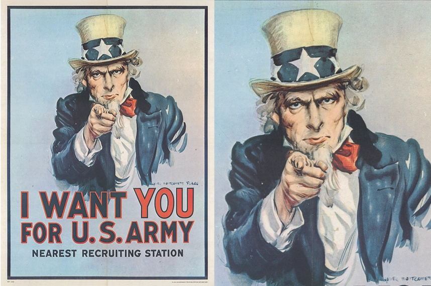
James Montgomery Flagg designed I Want You for the U.S. Army during World War I to encourage enlistment in the U.S. Army. The poster shows Uncle Sam pointing directly at the viewer, a gesture that became one of the most recognizable symbols of national duty in American history.
Flagg based the composition on a 1914 British recruitment poster that featured Lord Kitchener in the same pose. He first introduced his version on the July 6, 1916 cover of Leslie’s Weekly magazine, accompanied by the caption “What Are You Doing for Preparedness?”.
For the face of Uncle Sam, Flagg used himself as the model. He added a goatee and aged features to fit the image of an authoritative American figure. Over four million copies of the poster were printed during the war, and it was reused in later military recruitment campaigns, including World War II.
The design became so deeply embedded in American culture that many people later assumed it originated in the Second World War rather than the first.
2. We Can Do It! (1943)
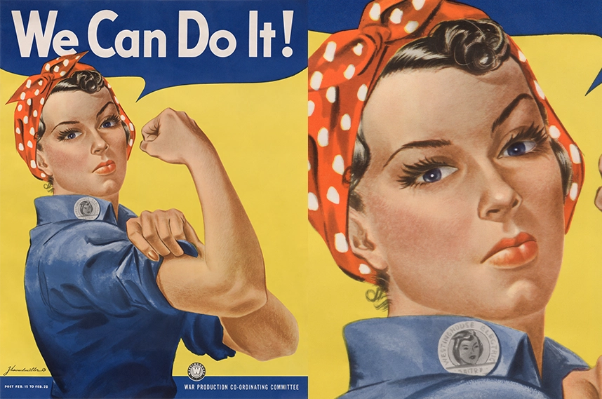
J. Howard Miller created We Can Do It! in 1943 for the Westinghouse Electric & Manufacturing Company during World War II. The poster was displayed only inside company factories for two weeks, from February 15 to 28, 1943, as part of an internal morale campaign rather than a national recruitment effort.
Miller’s design was one of a series commissioned by Westinghouse’s War Production Coordinating Committee. The posters aimed to reduce absenteeism, boost worker attitude, and prevent labor unrest among employees supporting wartime production.
The woman in the image wears a red-and-white polka-dot bandanna and rolls up her sleeve beneath the slogan “We Can Do It!” The design faded from view after the war and remained almost unknown for decades.
When it resurfaced in the early 1980s, the image was linked to the wartime character Rosie the Riveter. Research published in 2018 identified the real-life inspiration for the photograph behind the design as Naomi Parker Fraley, clarifying a long-standing attribution. Over time, the poster became widely recognized as a symbol of female strength and independence, far beyond its original corporate purpose.
3. Viva Che (1968)
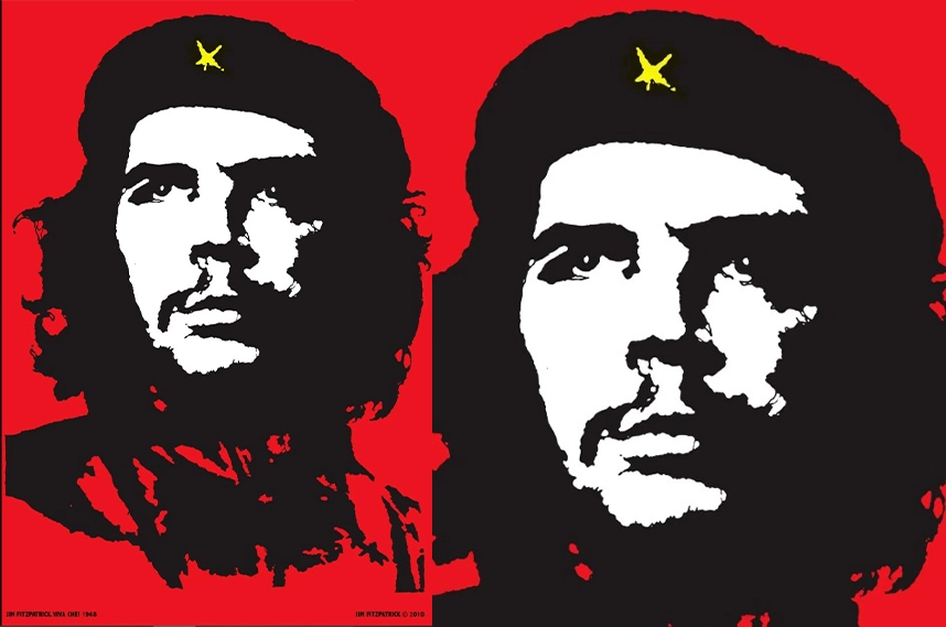
In 1968, Irish artist Jim Fitzpatrick created the iconic red-and-black silkscreen poster Viva Che, inspired by Alberto Korda’s 1960 photograph of Che Guevara. Fitzpatrick first encountered the image in 1967 through the Dutch anarchist group the Provos, who had received it via Jean-Paul Sartre.
Fitzpatrick used a paper negative to produce the image, printing it in black and red with a hand-painted yellow star on Guevara’s beret. He intentionally removed any copyright, aiming for the image to "breed like rabbits" and spread freely among left-wing groups in Ireland, France, and the Netherlands.
The poster gained international prominence during the May 1968 protests in France and anti-Vietnam War demonstrations worldwide. Its bold contrast and revolutionary energy transformed Guevara’s face into a global emblem of rebellion. Fitzpatrick later added a subtle personal touch by incorporating his initial, "F," on Guevara’s shoulder. He revealed this detail decades later, stating, "I’m a bit mischievous, so I never told anyone."
In 2008, Fitzpatrick announced his intention to transfer the copyright of the image to the William Soler Pediatric Cardiology Hospital in Havana, Cuba, to benefit Cuba’s medical system. However, the transfer remains unratified due to legal complexities.
The Viva Che poster remains one of the most enduring and widely reproduced images of the 20th century, symbolizing revolutionary spirit and the power of visual protest.
4. Hope (2008)
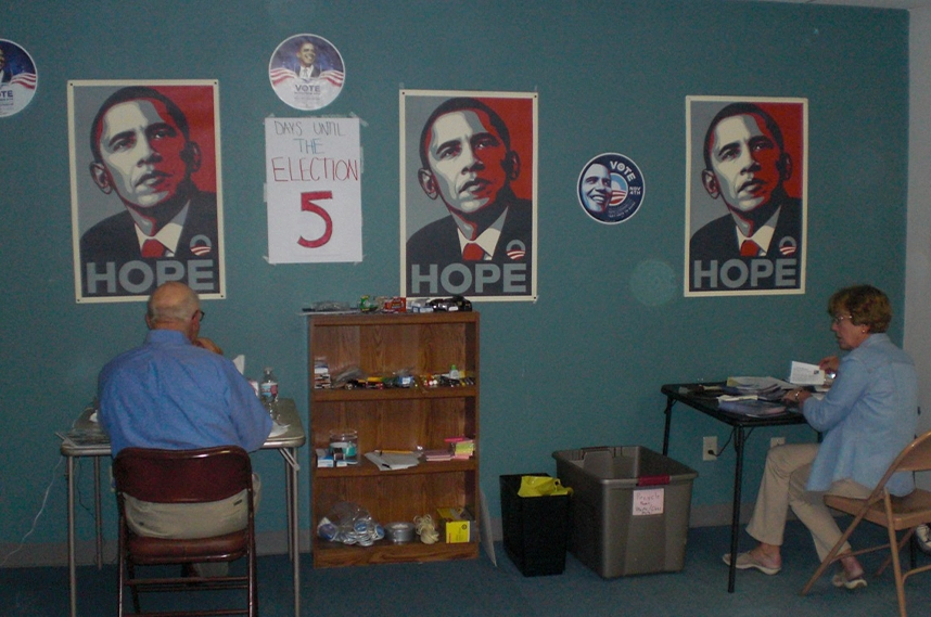
Shepard Fairey designed the Hope poster in 2008 to support Barack Obama’s presidential campaign. The image is a stylized stencil portrait of Obama in red, beige, and blue with the word "HOPE" beneath it. Fairey based the design on a photograph taken by Associated Press photographer Mannie Garcia.
Fairey first printed the poster as a street image and distributed it publicly, then made additional prints displayed at rallies and online. The poster spread rapidly through both digital channels and physical copies, becoming widely recognized during the campaign.
The design emphasized optimism and authority through its clean vector lines and tri-color palette, blending influences from street art and political realism. After the election, the poster’s mixed-media version was acquired by the Smithsonian’s National Portrait Gallery.
A legal dispute arose when the Associated Press identified the source photograph. Fairey claimed fair use, and the case was settled out of court. He later received probation, community service, and a $25,000 fine, but the controversy did not diminish the poster’s cultural impact.
The poster became one of the most enduring symbols of the 2008 election. Its approach to digital illustration, color branding, and grassroots distribution went far beyond that moment, setting a new visual standard for political campaigns and redefining how design could shape public perception.
5. Jaws (1975)
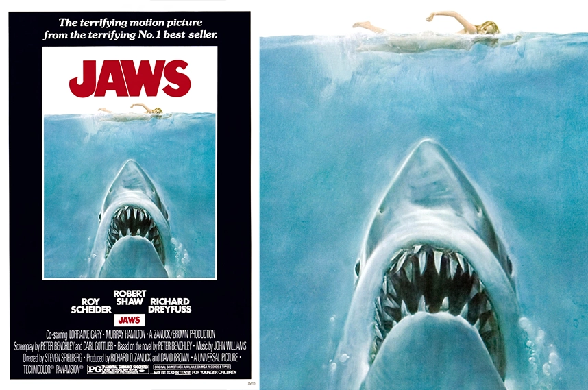
Roger Kastel designed the Jaws movie poster in 1975. The image shows a massive shark rising toward a swimmer at the surface of the water, immediately conveying tension and danger.
The artwork began as a 1974 paperback cover for Peter Benchley's novel Jaws. Universal Pictures adapted it for the film, keeping Kastel’s composition intact.
Kastel used a limited color palette of black, white, and blue to focus attention on the shark and swimmer. The shark is depicted as a shortfin mako, based on a preserved specimen at the American Museum of Natural History, which added realism to the illustration.
The poster became an iconic example of movie marketing and marked a turning point in how films were promoted. Its image-driven storytelling showed how a single image could define a film before audiences saw a frame.
 Home
Home Articles
 Twos Talks
 Videos
