Home
Home Articles
 Twos Talks
 Videos
5 Signs a Movie Poster Was Made with AI
AI can now create convincing movie posters. But the details that make them feel artificial have less to do with technology and more to do with design thinking.

A few years ago, spotting an AI-generated image was relatively easy. A suspicious hand or a few extra fingers could quickly turn a seemingly impressive image into a giveaway. As image generation models have improved, those obvious flaws have become far less common. Today, identifying an AI-assisted movie poster is less about spotting technical mistakes and more about understanding the design decisions behind the image. No single clue can prove AI was involved, but recurring patterns can reveal why some posters feel less intentional than others.
5. Typography Feels Added Instead of Designed
Typography is one of the clearest clues because it exists at the intersection of image-making and graphic design.
Strong movie posters integrate typography into the visual composition. The title works with the image to create balance and strengthen the film’s identity.
AI-assisted posters treat typography as a separate layer. Even when the lettering is technically correct, it can feel disconnected from the image beneath it. The type fills empty space without contributing to the visual balance of the poster.
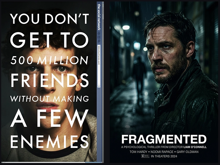
Example: The Social Network (2010)
The title interacts with the portrait, creating a visual tension between text and image.
What designers notice: Good typography becomes part of the poster itself and guides the viewer's experience.
4. The Composition Doesn’t Know Where to Look
A strong composition guides the viewer's eye through a clear visual hierarchy. Attention moves naturally because each design decision supports the next.
AI-generated movie posters struggle with this hierarchy. Multiple subjects compete for equal importance, and visual weight is distributed too evenly. No element clearly takes the lead, leaving the viewer to search for a focal poin
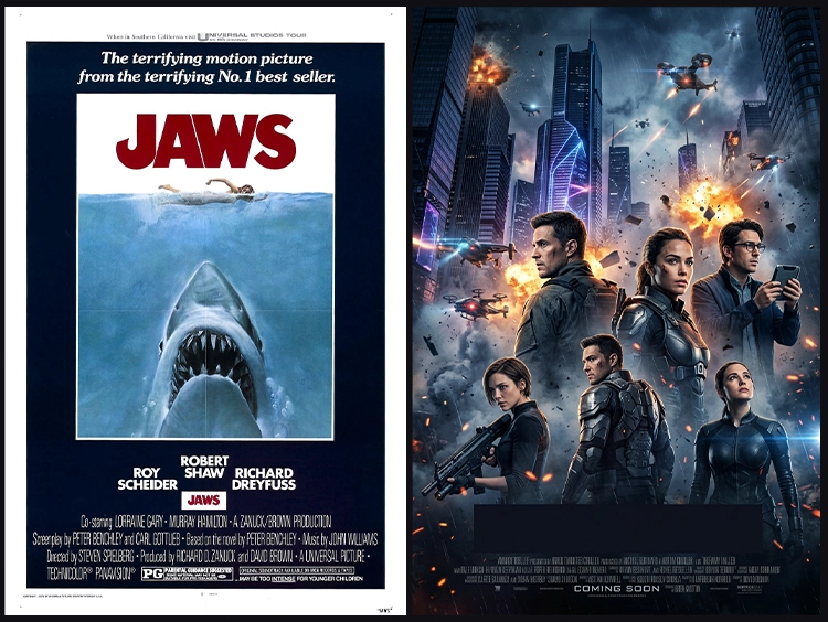
Example: Jaws (1975)
Nearly every visual decision points toward a single idea: the shark approaching the swimmer. There is no ambiguity about where the eye should go first.
What designers notice: A good composition decides what matters before the viewer has to.
3. The Art Direction Feels Inconsistent
Strong art direction creates visual consistency. Lighting, color, composition, and typography all point toward the same story.
Consistency is where many AI-generated posters begin to reveal their limitations. Photorealistic characters can stand beside painterly backgrounds. Dramatic cinematic lighting can coexist with advertising-style retouching. Every individual element can look convincing, but together they feel as though they belong to different projects.
The challenge lies in visual consistency.
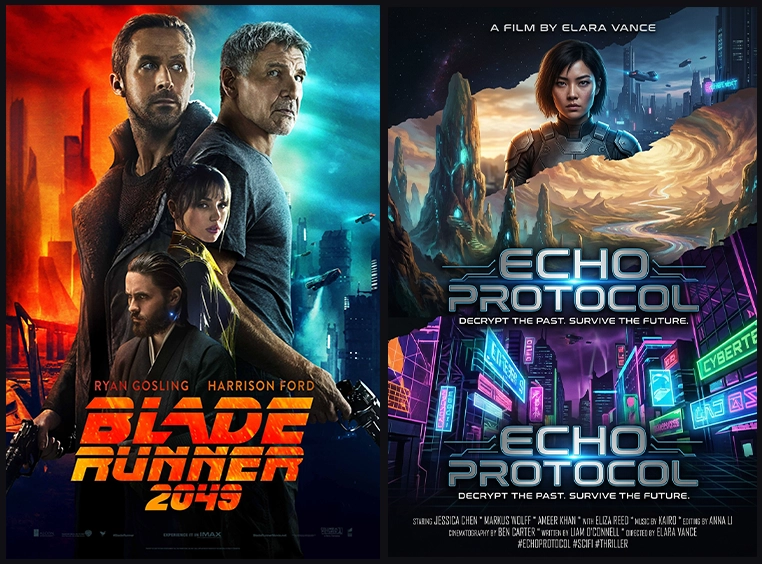
Example: Blade Runner 2049 (2017)
Whether you look at the orange desert scenes or the blue city interiors, the poster maintains one coherent cinematic language.
What designers notice: Art direction is ultimately a process of making hundreds of related decisions.
2. Everything Competes for Attention
Experienced designers understand that emphasis requires restraint. Not every element needs to carry the same visual weight.
Generative AI frequently produces images where every element seems designed to attract attention. Surfaces appear highly detailed, lighting feels exaggerated, and nothing seems willing to step back. The result can feel impressive at first glance but becomes difficult to process after a few seconds. Good poster design comes from deciding where attention belongs.
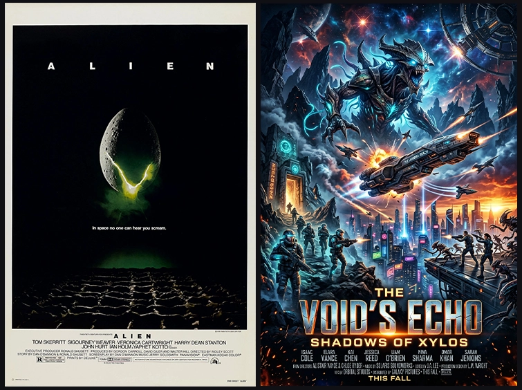
Example: Alien (1979)
The poster centers on a single glowing egg against a dark background. Most of the frame is intentionally quiet, which makes the focal point powerful.
What designers notice: Image models can generate visual richness. Designers decide what serves the message.
1. The Poster Adds More Than It Removes
Professional designers remove far more than they add. They simplify compositions and remove anything that distracts from the central idea, even when those elements are visually attractive.
Generative AI tends to move in the opposite direction. It keeps adding visual information until every part of the composition asks for attention. The image becomes richer, but not necessarily clearer.
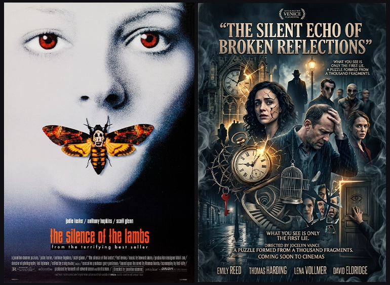
Example: Alien (1979)
The Silence of the Lambs (1991), Jaws (1975), and Anatomy of a Murder (1959).
All three posters are memorable because each one builds the entire composition around a focused visual idea.
What designers notice: AI can generate countless ideas. Design requires the discipline to choose among them.
Short Answers (FAQ)
How can you tell if a movie poster was made with AI?
AI-generated movie posters reveal patterns in visual decision-making. Common signs include weak visual hierarchy, inconsistent art direction, disconnected typography, excessive detail, and a lack of editing.
What are the signs of an AI-generated poster?
Common signs include too many competing focal points, inconsistent visual styles, typography that feels separate from the image, and compositions where every element demands attention.
Can AI create professional movie posters?
AI can generate visually impressive movie posters, but professional poster design depends on decisions such as editing, hierarchy, typography, and visual communication. The difference often comes from art direction rather than image quality alone.