 Home
Home Articles
 Twos Talks
 Videos
5 Typefaces That Changed History
A concise guide to five typefaces that influenced the way we read, design, and communicate, from Gutenberg’s Blackletter to the modern debate around Papyrus.

Typography guides the way culture expresses itself. It guides how information is shared, how brands are perceived, and how entire eras communicate visually. Some typefaces rise above functional use and enter design history. Here are five typefaces that changed the world in their own time and left a lasting influence on how we read today.
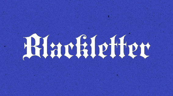
1. Blackletter
In 1440, Johannes Gutenberg introduced the movable type printing press, a breakthrough that changed book production and helped accelerate the Renaissance. To maintain a sense of continuity with the manuscripts of the period, he designed a typeface modeled on medieval handwriting. Blackletter, with its dense and angular forms, signaled the move from manual copying to large-scale printing. It reflects the cultural change brought by printing technology.
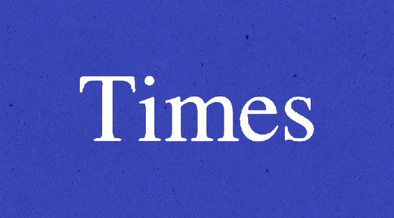
2. Times
In 1929, the manager of The Times of London learned that typographer Stanley Morison found the newspaper’s typography lacking in clarity and visual discipline. Morison was brought in to redesign the paper from the ground up. His solution was Times New Roman, a typeface created specifically for efficient newspaper printing, high legibility, and modern appeal. It soon became one of the most widely distributed typefaces in history. Its presence on computers worldwide shows that Morison’s design reached far beyond its original newsroom.
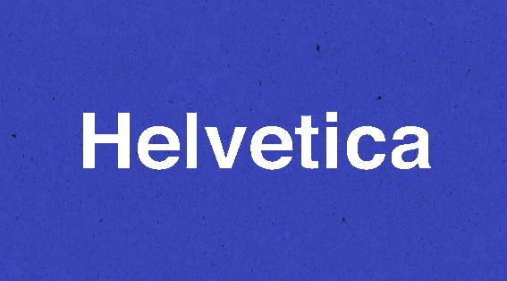
3. Helvetica
In 1957, Swiss type designer Max Miedinger created Helvetica, which became the signature typeface of the International Typographic Style. Its clean forms, balanced proportions, and neutral voice made it appealing to designers who wanted typography that did not distract from the message. Helvetica spread quickly across Europe and then the world, becoming a symbol of modern clarity. Its adoption by major transport systems, including the New York City Subway, shows its functional universality.
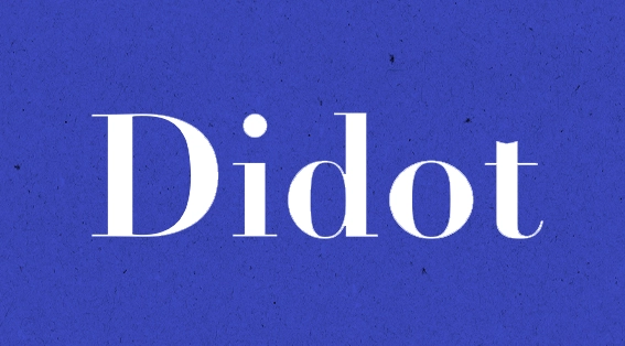
4. Didot
Firmin Didot designed Didot in the late eighteenth century. The high-contrast serif features sharp verticals and delicate hairlines, giving it a refined and precise appearance. Luxury publications such as Vogue and Harper’s Bazaar adopted Didot to convey sophistication and exclusivity. In a 2015 survey, it ranked as the most expensive looking typeface among the options tested. Didot remains a reference for elegance in modern typography.

5. Papyrus
Chris Costello created Papyrus in the 1980s as a hand-drawn typeface inspired by ancient Middle Eastern scripts. It later faced widespread criticism for overuse and inappropriate applications, yet it reached mainstream culture in unexpected ways. Papyrus appeared on restaurant menus, film posters, and other mainstream applications, becoming a symbol of both accessibility and typographic misuse. Its influence demonstrates that a typeface can gain prominence through exposure rather than technical perfection.


