How Jonathan Barnbrook Became David Bowie's Favorite Graphic Designer?
how Jonathan Barnbrook became David Bowie’s favorite designer, shaping iconic album covers from Heathen to Blackstar through creativity, trust, and collaboration

Editor’s Note:
This article is adapted from our podcast interview with Jonathan Barnbrook, originally recorded for Twos Talks and released on the Twos Studio YouTube channel. It has been edited for clarity and format
In this episode of Twos Talks, we sat down with Jonathan Barnbrook: the designer behind David Bowie’s most daring album covers. Barnbrook’s work on albums from Heathen to Blackstar went beyond visual design, and he played a key role in shaping their message. This is the story of their fearless collaboration and the creative trust that defined it.
When David Bowie called
Most design stories begin with a pitch. Jonathan Barnbrook’s started with a phone call, from David Bowie.
"He phoned me up, which is very cool from David Bowie! Yes. I could hardly believe it was him actually."
Bowie had seen Barnbrook’s graphic work for Damien Hirst and wanted him to design a book for his wife, Iman. That first meeting led to a creative relationship that lasted until the very end of Bowie’s life. Barnbrook would go on to design the covers of Heathen, Reality, The Next Day, and Blackstar, shaping the visual identity of Bowie’s final and most daring records.
Working directly with Bowie
Bowie didn’t operate through assistants. Every decision, every feedback loop — it was personal.
"I've worked with other big artists and the best ones talk to you directly. There's no assistant or PA in the way. It's very important that it is all direct."
What Barnbrook remembers isn’t just Bowie’s vision or fame; it was the collaboration. Each project wasn’t a simple commission. It was a creative conversation.
"The cover was a dialogue between myself and David Bowie. It's not like there's a presentation and he would respond."
No to nostalgia: The Next Day
By the time The Next Day came around, Bowie had been silent for a decade. Most designers would have been tempted to lean into nostalgia. Barnbrook and Bowie had other plans.
"We were determined not to do that, especially after 10 years. Now he's a different person from when he did his last album completely."
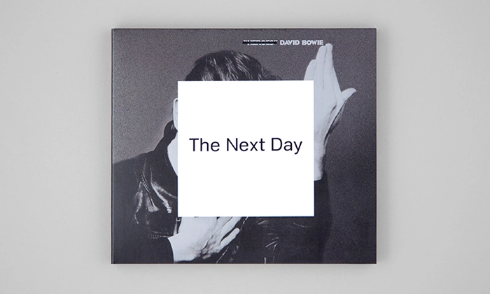
The solution? A white square pasted over the Heroes album cover, with a blunt, black text reading The Next Day. It was minimal, disruptive, and deliberate.
It didn’t just break Bowie’s own visual history. It broke the internet.
Designing Blackstar, Bowie’s final chapter
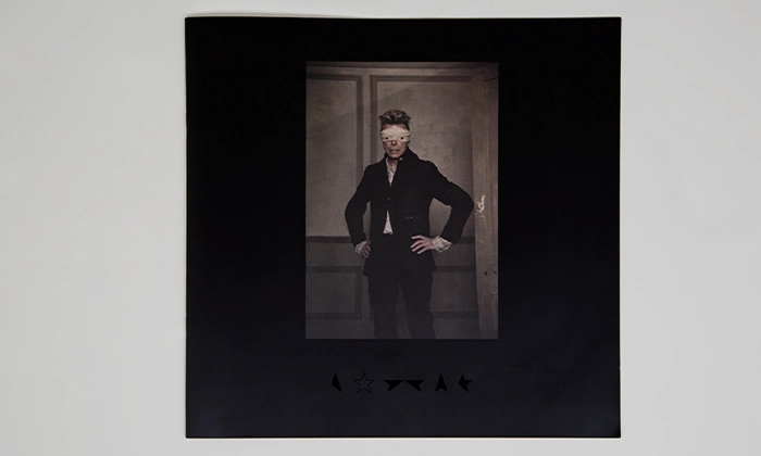
The last time Barnbrook saw Bowie was during the work on Blackstar. Bowie was facing the reality of his illness, and the album's design reflected it with an honesty rarely seen in pop culture.
"This was a man who was facing his own mortality, and I hope the design is appropriate to that."
They kept the cover minimal. Just a black star. But its simplicity was deceptive; the design was meant to invite reinterpretation, remixing, even participation. In Bowie’s final act, he opened the space for fans to join him in shaping the narrative.
"It was really important that there was some feeling of inclusivity rather than just being served up the record and the graphics."
To do that, they released the artwork under Creative Commons. It wasn’t a branding move. It was a farewell gift.

Trust, respect, and returning clients
Beyond the music industry, Barnbrook has long been a respected figure in graphic design and type design (his Mason typeface was acquired by MoMA). But what he emphasized in our talk was something every young designer needs to hear:
"If any young designers are listening to this, the best way to maintain your business or your practice is to get repeat business... people enjoy the experience of working with you, they'll come back."
Design is about more than the output. It’s about how it feels to work with you.
"It's not just your portfolio. It's how you are when you work with someone."
It’s a lesson that applies whether you're working with friends, or with David Bowie.
One of one
Jonathan Barnbrook didn’t just design for Bowie. He worked with him. The result: some of the most conceptually daring, emotionally honest, and culturally significant album visuals of the 21st century.
The collaboration wasn’t built on trends. It was built on trust, and the courage to take risks together.
"When people talk about David Bowie, he was an extremely intelligent person... very thoughtful, very respectful. He didn’t have a massive ego."
Want more from Barnbrook?
For more insight from this iconic, Grammy-winning designer, including unseen stories and advice for creatives, watch the full interview on our YouTube channel.
 Home
Home Articles
 Twos Talks
 Videos
