Home
Home Articles
 Twos Talks
 Videos
Is Hollywood Scared of Good Poster Design?
Hollywood’s greatest movie posters, created by Saul Bass, Drew Struzan, Bob Peak, and Richard Amsel, told stories through art. Today, studios favor floating heads, leaving creativity and craftsmanship behind.

Movie posters once invited audiences into the world of a film before a single scene played on screen. Designers like Bass and Struzan created images as memorable as the movies themselves. Now, Hollywood often chooses a safer approach, prioritizing star faces over concept and narrative design.
The Golden Age of Poster Design
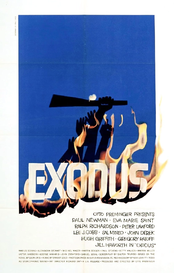
In 1960, Otto Preminger’s Exodus was about to hit theaters. The movie had a big budget and starred Paul Newman. Preminger turned to Saul Bass for the poster. Bass stayed true to the story, trusting the audience to care about it. The result was a powerful, concept-driven design that matched the film’s ambition. Exodus became the third highest-grossing movie of the year and one of Preminger’s most successful releases.
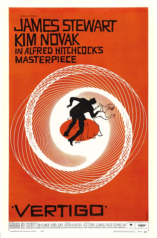
Bass’s posters, including The Man with the Golden Arm and Vertigo, combined abstract imagery with narrative insight. They guided viewers into the world of the film and created its visual identity before audiences entered the theater. His use of bold shapes, typography, and symbolism created a visual language that reflected story themes and character psychology. Posters during this period were storytelling tools, conveying the tone and character of each film while establishing a distinct visual presence.
Hollywood’s Formula
When Ridley Scott made Exodus in 2014, the poster looked very different. Today, studios often place star faces at the center, while story, mood, and narrative cues take a back seat. The focus is on instant recognition, global branding, and potential box office draw.
Many contemporary posters rely on photography without innovative concepts or creative storytelling. Faces are arranged in predictable ways, and compositions often repeat familiar patterns. Designs rarely convey the film’s tone, themes, or narrative depth. Posters now compete with streaming thumbnails, online banners, and social media ads, which reinforces formulaic layouts and celebrity-focused visuals.
The result is visual standardization. Posters often lack the unique composition, symbolism, and narrative insight that made Bass or Bob Peak’s work memorable. Artistry is frequently secondary to commercial concerns.

Still, Art Can Shine
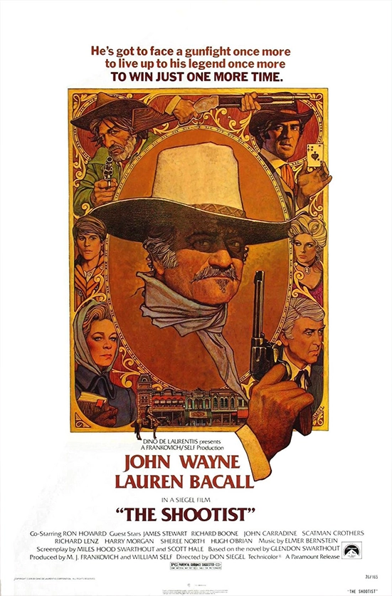
Some contemporary posters demonstrate that concept and artistry remain possible. Drew Struzan’s poster for The Shawshank Redemption presents the cast while hinting at the story. Richard Amsel’s poster for The Shootist shows how careful composition can define a movie’s identity. Comparing these designs to today’s typical posters reveals a loss of care and craftsmanship.
Outside mainstream marketing, filmmakers, collectors, and specialty releases continue to celebrate illustrated or concept-driven posters. Limited editions and art prints allow designers to reclaim poster design as a creative discipline. This proves that the art form is still alive, even if Hollywood often ignores it.
The Anatomy of a Great Poster
Great poster design requires vision, storytelling, and attention to detail. Principled designers like Saul Bass, Bob Peak, Richard Amsel, and Drew Struzan approached each poster with dedication. They created designs that served the film, communicated its story, and carried their own artistic signature.
In today’s formula-driven Hollywood, designers with such integrity and ambition would rarely find the opportunity to work. Their contributions risk being overlooked entirely, and the careful craft that once defined cinematic identity is often lost.