Home
Home Articles
 Twos Talks
 Videos
Is Less Still More?
Why are we suddenly missing the detail we once designed away? How did minimalism take over, and is it starting to swing back?
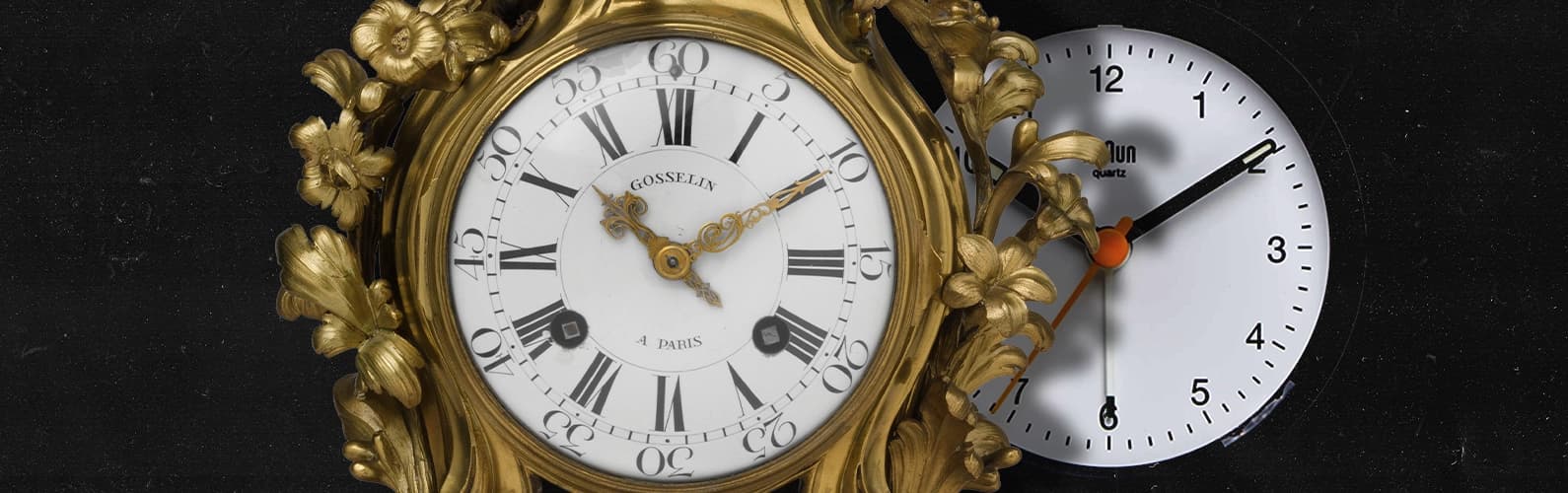
Look at the way we talk about design today and something feels different. Images of colorful interiors and expressive logos keep resurfacing, often with the same question underneath them: what happened to all of this? For years, simplicity seemed to offer a cleaner, smarter future, and gradually it became the visual language of almost everything around us. Now, as old details start to look appealing again, it is worth asking how we got here in the first place. Did we simply take minimalism too far, or are we watching another turn in the cycle between simplicity and expression?
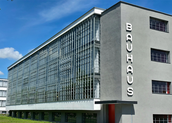
Photo: JensKunstfreund. CC BY-SA 4.0
The Roots of Simplicity
For much of design history, detail was simply part of the job. Buildings, furniture and everyday objects were shaped by ornament and craftsmanship, and visual complexity often came from the way things were made. The push toward simplicity gained force in the late 19th and early 20th centuries, when new ideas about modern life began to challenge that tradition. Architects such as Adolf Loos argued fiercely against ornament. They treated its removal as part of a broader cultural shift toward modernity. His famous essay Ornament and Crime became one of the most influential statements of that position.
The Bauhaus helped turn that thinking into a broader design language. The Bauhaus building in Dessau, with its steel, glass and clearly expressed functional elements, was an emblem of a new architecture inspired by industrial methods and modern life. The idea was to strip away elements that no longer seemed necessary and let structure, material and function carry more of the visual weight.
That distinction is important because the original modernist idea of simplicity was far richer than the version we recognize today. Mies van der Rohe was synonymous with less is more, but MoMA notes his deep interest in materials and texture, alongside the other phrase associated with him, God is in the details. His work suggests that reducing the visual noise of a building did not necessarily mean reducing the attention paid to its smallest parts.
The same tension later appeared in product design. Dieter Rams described good design as both restrained and “thorough down to the last detail,” before arriving at his famous principle of “as little design as possible.” For Rams, less meant concentrating on what mattered and removing what did not. The details still mattered. They simply had to earn their place.
That idea would prove remarkably influential. Over the decades, simplicity moved from being one response to the problems of modern design to becoming one of its dominant visual languages. The next step would come when that language met a new environment: the screen.
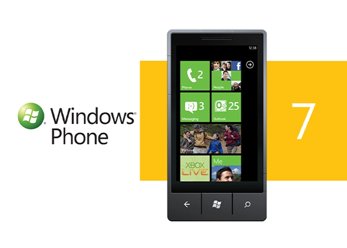
Photo: Microsoft Sweden. CC BY 2.0
The Screen Changes the Rules
The rise of digital interfaces made simplicity more practical. A screen offered limited space, and people had to understand what they were seeing quickly. Microsoft’s Metro language for Windows Phone, introduced in 2010, deliberately reduced visual clutter and put typography and content at the center of the interface. Microsoft’s designers described the approach as “authentically digital,” responding to the constraints and possibilities of handheld devices.
Apple pushed the same shift into the mainstream with iOS 7 in 2013. The redesign moved away from the richer visual cues of earlier iOS versions toward flatter forms, cleaner typography and a stronger reliance on the screen itself. Jony Ive described simplicity as a way of bringing order to complexity. The goal was still to make a complicated system easier to navigate.
The screen also changed what a successful graphic element had to do. A logo, icon or interface could appear in many sizes and contexts, sometimes only a few pixels wide. Detail that depended on texture, shading or fine ornament could disappear at smaller scales. Reduction offered a practical answer, and digital design gradually made that reduction feel natural.
The visual language of apps and operating systems started to influence products and brand identities. Simplicity was starting to look like the visual language of the future.
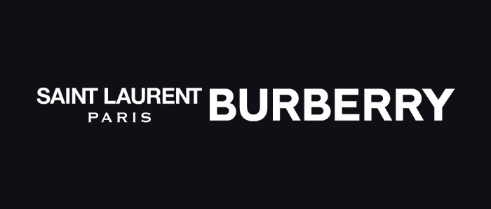
Minimalism Takes Over Branding
As digital culture spread, the visual language of the screen started to shape the brands around it. Sans-serif type and simplified marks worked well across websites, apps and social feeds. For young tech companies, this language also suggested a sense of being current and at home in the digital world. It soon spread from startups into more established categories.
Luxury fashion followed the shift in a particularly visible way. During the 2010s, brands such as Yves Saint Laurent and Burberry simplified their identities and moved toward cleaner typographic systems. Monotype noted in 2019 that even brands with long-established heritage, including Calvin Klein, Yves Saint Laurent and Burberry, were streamlining their logos and typography.
By then, simplicity had acquired a new role. It could make a brand feel current before anyone had read a word about what the brand actually stood for. The visual formula was easy to reproduce across different formats, which made it especially useful in a world increasingly experienced through screens. On Instagram, that sameness was particularly visible. Fast Company documented the rise of young brands with similar restrained identities in 2018, describing the phenomenon as “blanding.”
The idea captured an awkward contradiction at the heart of modern branding. Simpler identities could work better in small digital spaces, yet the same simplification could erase details that had made individual brands memorable in the first place.
The problem, then, was less about simplicity itself than what happened when a successful visual solution spread everywhere. Once the same visual language appeared across more and more brands, being simple was no longer enough to stand apart.
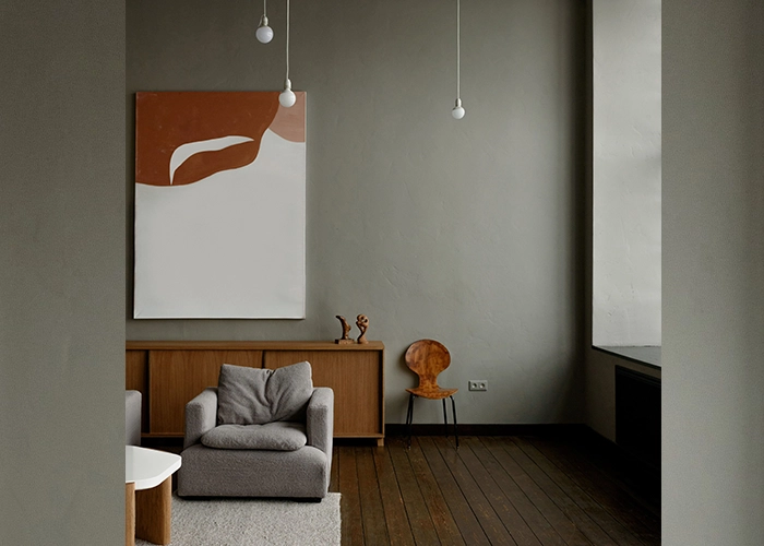
Photo: Ksenia Chernaya
The Age of Sameness
The same logic soon spread beyond screens and brand identities. Interiors became quieter, with pared-back furniture and large uninterrupted surfaces. Architecture followed a similar direction, putting greater emphasis on light and material. Minimalism was starting to shape what contemporary design looked like.
The change can even be traced through the objects around us. A 2020 analysis by the Science Museum Group examined 7,083 objects across 21 categories and found that grey had become more prevalent over time, alongside a decline in brown and yellow. The researchers linked part of the shift to changes in materials, including the move away from wood. The study has an important limitation: the museum collection is not a random sample of everything people have owned. Still, it offers a useful glimpse into a broader visual shift.
Something changed when these choices became widespread. A restrained logo could once feel unusual. An uncluttered interior could feel fresh. A simple object could signal a new way of living. Once similar decisions appeared everywhere, the effect changed. Simplicity itself started to fade into the background.
This is where the conversation around design sameness enters the picture. D&AD has described a growing concern within the industry that brands are converging around familiar visual codes, making distinctiveness harder to achieve.
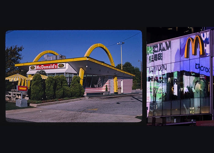
Left: John Margolies. Library of Congress
Right: Julian Lupyan. CC0 1.0
A Quieter McDonald’s
Few brands make the shift more visible than McDonald’s. Old restaurants were hard to miss. Red and yellow dominated the exterior, the Golden Arches stood out from a distance, and the interiors carried the playful visual world of the brand inside. Over time, that language started to recede. Bright colors gave way to muted palettes, familiar architectural forms disappeared, and the interiors took on a quieter, more contemporary character.
The change was deliberate. McDonald’s began redesigning its restaurants in the 2000s as part of a wider effort to update the brand and rethink the restaurant experience. Landini Associates pushed that idea further with Project Ray, first launched in Hong Kong in 2015. The studio says the brief was to bring millennials back to the brand and create a quieter, more contemporary experience centered on the people and the food. Timber, stainless steel and glass replaced much of the visual noise associated with older restaurants.
The thinking behind the redesign was closely tied to a changing idea of what a modern restaurant could be. A quieter interior could feel more contemporary. At the Times Square flagship, Landini described the interior as a minimalist combination of stainless steel and timber, designed to offer a calmer environment amid the intensity of the city. The intention was to create a “recognizable neutrality” and a place of calm amid increasingly noisy urban environments.
Then something interesting happened. People started looking backwards. In 2025, images comparing older and newer McDonald’s restaurants circulated widely on social media, with one discussion reaching more than 200,000 likes and 8,800 comments. The reaction often seemed to be less about nostalgia for a particular burger than about the feeling that something visually distinctive had disappeared.
The Return of Detail
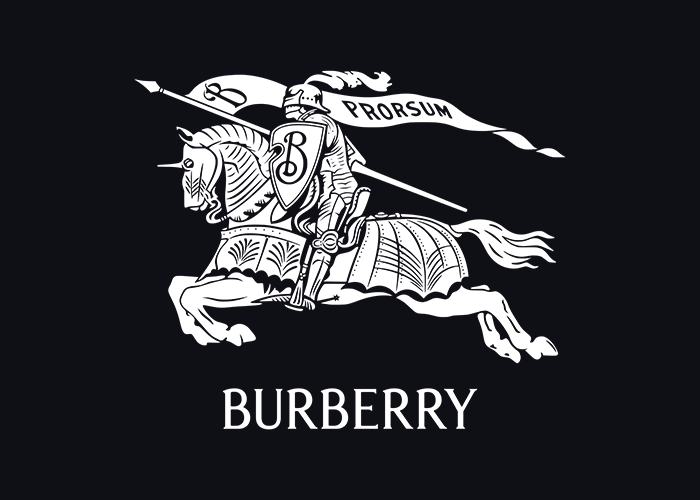
The reaction has been visible in graphic design for several years now. Burberry offered a highly visible example in 2023, when the brand brought back its 1901 Equestrian Knight and replaced the sans-serif wordmark introduced in 2018 with a serif wordmark inspired by its archive. Design Week noted at the time that luxury fashion had spent years moving in the opposite direction, with many brands adopting similar sans-serif identities for digital flexibility.
By 2024, the shift was becoming harder to ignore. Designers were exploring identities with more personality and visual complexity. The shift suggested that the industry was beginning to question simplification for its own sake. Some brands continued to choose restrained identities, too. Minimalism itself was hardly disappearing.
Now the pendulum seems to be moving further. In its 2026 awards, D&AD reported seeing more maximalist identities, with expressive typography and louder visual systems standing out as a response to conformity. Canva’s 2026 trend report points in a similar direction, tracking stronger interest in tactile textures, DIY aesthetics and heritage-led visual languages. None of this means that people have collectively fallen out of love with simplicity. It suggests that after years of reduction, visual character has started to feel valuable again.
Instagram itself offers an interesting current example. Its 2026 identity refresh keeps simplicity at the core while expanding the brand’s typography and using its gradient more subtly. The result leaves more room for personality without abandoning clarity.
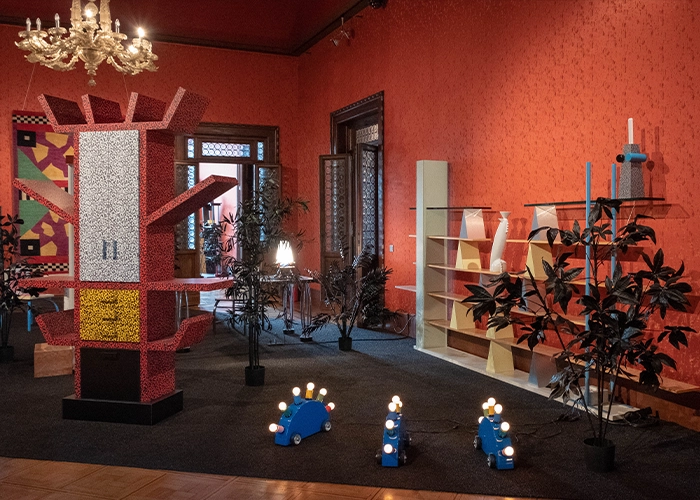
Photo: Caffe_Paradiso. 2018. CC BY 2.0
The Pendulum Swings Again
The turn from modernist restraint to postmodern design in the late 20th century brought colour, historical references and overt decoration back into furniture and architecture. Memphis became one of its clearest expressions.
The current return to detail may be part of the same cycle. After years of reducing visual noise, designers and audiences are paying more attention to the things that make one object, space or identity feel different from another.
AI adds another layer to this story. The same tools can support a pared-back visual language or a more expressive one. Canva’s 2026 trend report captures both impulses, from its structured “Opt-Out Era” to tactile and imperfect aesthetics. AI looks less like an explanation for the shift than a tool that can accelerate either side of it.
That may be the more interesting question behind the current backlash against minimalism. Perhaps the appeal of detail has less to do with wanting everything to look busier and more to do with wanting things to feel more specific. A serif or an unusual shape can carry a sense of character that is difficult to achieve through reduction alone. So can an imperfect texture or an unexpected color. After years of hearing that less is more, design may simply be asking whether there can be such a thing as too little.
Short Answers (FAQ)
Why did design become more minimalist?
Modernist ideas and digital technology pushed design toward simpler forms that were easier to use, reproduce and adapt across different contexts.
Why do so many modern brands look similar?
As more brands adopted simplified logos and digital-friendly identities, some of the details that once made them distinctive became harder to see.
Is maximalism making a comeback in design?
More expressive identities and richer visual detail are becoming increasingly visible, although minimalism remains widely used.