Home
Home Articles
 Twos Talks
 Videos
Is McLaren’s New Logo Looking Backward?
McLaren is expanding its business with a new identity rooted in its founder’s family history. The new wordmark makes that personal history part of a global brand system.
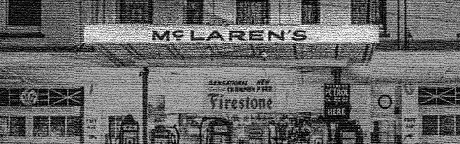
McLaren introduced a new brand identity on September 22. The new system brings its Racing and Automotive businesses under one visual identity. At the center of the identity is a new wordmark inspired by a sign above the McLaren family service station in Remuera, Auckland. The service station was owned by Bruce McLaren’s parents, Les and Ruth, and was where Bruce built the car that took him to his first racing victory. The choice brings one of McLaren’s oldest stories into its new corporate identity as the company expands into new areas.
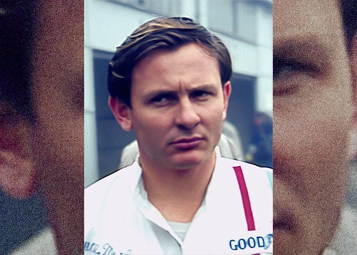
Photo: Lothar Spurzem. CC BY-SA 2.0 DE
The Sign Above the Garage
The sign above the McLaren family service station in Remuera once marked a local garage. Its lettering now anchors the company’s new wordmark. McLaren has adapted the sign into a contemporary mark using McLaren Sans, a bespoke sans-serif typeface. The lowercase “c” sits on a short horizontal line that matches the height of the surrounding letters. The Speedmark sits alongside it as a secondary identifier.
The garage was part of Bruce McLaren’s early working life, and the sign belonged to his family’s business. The new wordmark carries that reference into the wider McLaren identity, where a piece of local history now identifies a global brand.
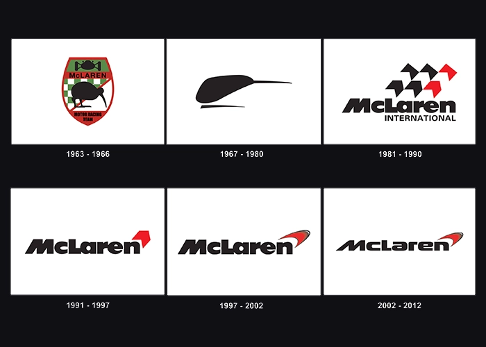
McLaren Has Changed Its Mark Before
McLaren’s visual identity has changed several times since the first crest appeared in 1964. That crest centered on a kiwi, Bruce McLaren’s national symbol. The Speedy Kiwi arrived in 1971, alongside the papaya color that became closely associated with the marque. In 1981, the team moved to a new McLaren International logo designed by Raymond Loewy.
The Speedmark entered the identity in 1997 and continued through later refinements. The 2021 version gave the mark a papaya color for McLaren Racing and introduced a slimmer wordmark for a more digital-focused identity. The 2026 change takes a different route. Its new wordmark draws directly from the founder’s family history in New Zealand.
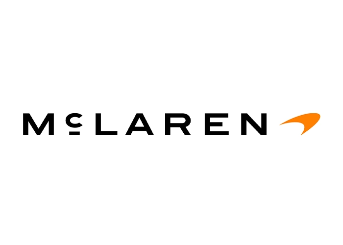
A New McLaren
The wordmark is only one part of the new system. The Speedmark sits at the heart of the identity. Papaya continues as a defining element, alongside an expanded color palette inspired by moments from McLaren’s history. The Speedy Kiwi is also part of the new system, keeping another link to Bruce McLaren and the company’s New Zealand roots.
McLaren is keeping several familiar signals in place as it introduces a new dominant wordmark.
The Bigger Brand
The identity arrives as McLaren is preparing for a larger business. The company has confirmed a £500 million investment program to expand its UK manufacturing and engineering footprint. Its plans include a new performance SUV as McLaren adds new types of vehicles to its range.
It also gives the new identity a practical job. McLaren now needs the same name to work across a wider operation than the one associated with its traditional supercar range. The new system is being introduced at the same moment as that operation is expanding.
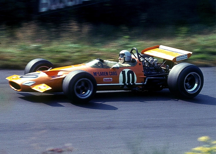
Photo: Lothar Spurzem. CC BY-SA 2.0 DE
Heritage as an Asset
The sign above the Remuera service station once identified a family business. In 2026, its design language identifies McLaren itself.
That is the more unusual part of this rebrand. A specific piece of family history has been taken from its original context and adapted for use across a global identity. The wordmark can now carry that reference across the McLaren brand.
McLaren presents the new identity as a link between its origins and its future. The wordmark gives that idea a specific form. A sign from the family garage now carries the McLaren name across a global brand system. A piece of local history has taken on a new role inside the company’s current identity.
FAQ
Why did McLaren change its logo?
McLaren says the new identity creates a more connected expression across McLaren Racing and McLaren Automotive as the company grows.
Where did the new McLaren logo come from?
The new wordmark was inspired by the sign above the McLaren family service station in Remuera, Auckland, owned by Bruce McLaren’s parents, Les and Ruth.
Did McLaren remove the Speedmark?
No. The Speedmark appears as part of the new identity alongside the new wordmark.