 Home
Home Articles
 Twos Talks
 Videos
The 7 Worst Fonts in Graphic Design History
Why designers hate these fonts, how they became some of the most overused typefaces in design history, and whether they truly deserve their reputation as the “worst fonts”.

When you look at discussions about typography, they are often judged by instinct rather than intention. Some typefaces become iconic, others become infamous, usually because of how and where they are used rather than any inherent flaws in their design. Over time, overexposure in templates and misuse in branding and pop culture have created lasting negative perceptions around certain fonts in graphic design history. This article looks at seven of the most controversial typefaces that designers continue to debate, and briefly explores why their reputations became so complicated.
7. Bleeding Cowboys
Context
A decorative display typeface that appeared in the mid-2000s (circa 2007), built to feel rough, distressed, and western-inspired. It was designed to carry a handmade, edgy visual tone.
Rise
It spread quickly through mid-to-late 2000s internet design culture, especially in posters, MySpace layouts, band flyers, and DIY branding.
Overuse / Fall
Free availability in font libraries between 2005 and 2010 led to heavy overuse. It turned into a default “edgy” solution, used across completely unrelated contexts from rock bands to commercial branding.
Designer Verdict
Bleeding Cowboys is often referenced as an example of how accessibility and visual clichés can weaken a typeface’s professional credibility.
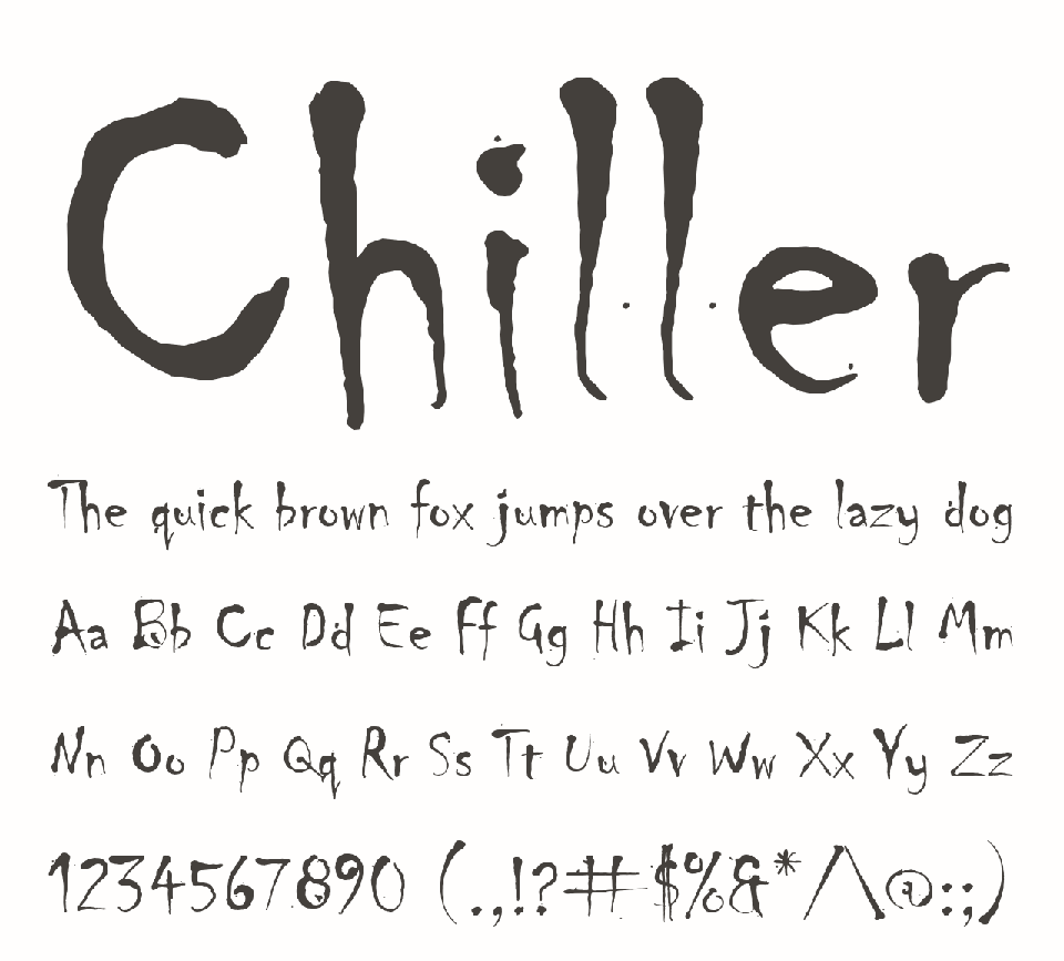
6. Chiller
Context
This horror-inspired display typeface was released in 1995. It uses uneven strokes and sharp letterforms to create tension and visual discomfort.
Rise
It became widely used in the late 1990s and early 2000s through Microsoft software and consumer publishing tools, appearing in horror posters, school projects, and informal design work.
Overuse / Fall
By the 2000s and early 2010s, repeated use in templated horror visuals made it predictable. It became the automatic choice for anything “spooky,” regardless of context.
Designer Verdict
Over time, it has come to represent how a strong thematic idea can lose its impact when it is repeated too often and applied without restraint.
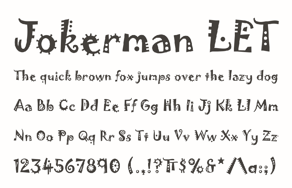
5. Jokerman
Context
Jokerman debuted in 1991. It combines exaggerated curves with irregular forms, creating a visual rhythm that moves between playful energy and chaotic expression.
Rise
It gained popularity in the 1990s and early 2000s through desktop publishing tools and default font libraries, especially in posters, invitations, and school projects where visual impact mattered more than restraint.
Overuse / Fall
By the 2000s, widespread use in casual design work and templates made it visually exhausting. It became a shorthand for loud, playful design, often repeated without attention to tone.
Designer Verdict
Jokerman shows that a novelty-driven design can lose clarity once it becomes a default visual shortcut.
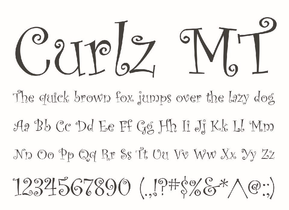
4. Curlz MT
Context
Curlz MT entered the market in 1995. Swirling terminals and decorative curves gave it a distinctly whimsical and expressive personality.
Rise
In the late 1990s and early 2000s, it gained visibility through Microsoft software and consumer publishing tools. It became common in invitations, greeting cards, classroom materials, and informal design projects.
Overuse / Fall
Its decorative nature eventually worked against it. As it appeared in more templates, its playful tone began to feel repetitive and predictable.
Designer Verdict
The same qualities that made Curlz MT recognizable also limited its use beyond a narrow range of contexts.
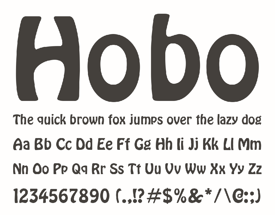
3. Hobo
Context
Hobo was designed in 1910 and avoids straight lines and sharp edges, resulting in a rounded and unusual letterform structure.
Rise
Decades later, it reappeared through digital font libraries, where its distinctive personality made it a recognizable option for informal branding and signage.
Overuse / Fall
Its unusual structure led to inconsistent application. It was often used in situations that required neutrality and clarity, which made it feel visually out of place.
Designer Verdict
Hobo becomes problematic when its structural identity is applied outside the visual logic it was originally built for.
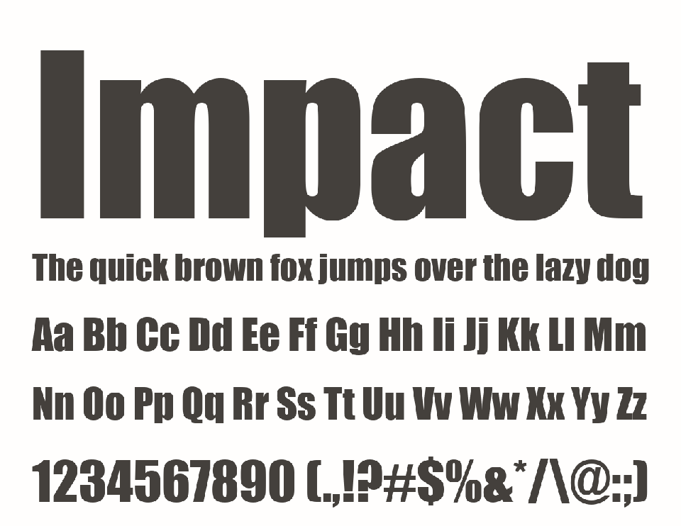
2. Impact
Context
Impact was released in 1965 as a bold, condensed sans-serif typeface designed for maximum visibility in headlines and signage.
Rise
In the late 1990s and early 2000s, it became widely accessible through digital tools. It was commonly used in advertising, headlines, and later online content.
Overuse / Fall
With the rise of internet memes in the 2000s and 2010s, Impact became strongly associated with meme captions and exaggerated online humor, moved its perception in visual culture.
Designer Verdict
Impact started as a typeface for clear communication in headlines, but its meaning changed through repeated use in digital environments and meme culture.

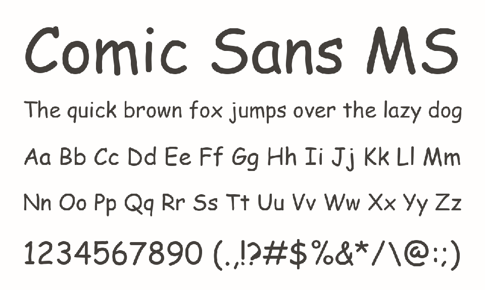
1. Comic Sans
Context
Comic Sans was designed in 1994 as an informal, handwritten-style typeface intended for casual and friendly communication in user interfaces.
Rise
It was widely distributed through Microsoft software and quickly entered everyday use in presentations, documents, and informal digital communication.
Overuse / Fall
As availability increased, it appeared in contexts far beyond its original intent, including professional and formal settings. This mismatch led to widespread criticism and a strong negative perception within the design community.
Designer Verdict
Comic Sans is one of the clearest examples of how intention and perception can diverge in type design, making it one of the most debated typefaces in graphic design history.
Honorable mention: Papyrus
Context
Papyrus was designed in 1982 by Chris Costello. Inspired by ancient inscriptions and handmade lettering, it combines rough edges with organic forms to create an aged, handcrafted appearance.
Rise
It became one of the most widely available decorative fonts through desktop publishing software and was heavily used throughout the 1990s and 2000s in logos, restaurant menus, wellness brands, cafés, and themed entertainment. Its appearance in the 2009 film Avatar logo made it even more recognizable.
Overuse / Fall
Its distinctive style became a default choice for anything meant to feel ancient, natural, or exotic. As it appeared across countless unrelated brands and templates, many designers began to view it as an overused visual cliché.
Designer Verdict
Papyrus is often cited as an example of how a highly distinctive typeface can lose its originality when it becomes the predictable solution for a particular visual style.
______________________
Short Answers (FAQ)
What is considered the worst font in graphic design?
There is no single “worst” font in graphic design. However, many designers consider Comic Sans the most controversial typeface because of its widespread use in inappropriate contexts instead of flaws in its original design.
Why do graphic designers hate certain fonts?
Designers usually dislike fonts that have become overused, misused, or strongly associated with clichés. In many cases, the criticism is directed at how the font is used rather than the typeface itself.
Is Comic Sans actually a bad font?
Not necessarily. Comic Sans was designed for informal and friendly communication. Its negative reputation comes mainly from being used in professional, corporate, or formal settings where it does not fit the intended tone.


