Home
Home Articles
 Twos Talks
 Videos
The Nike Swoosh: Designs That Changed History
The $35 student-made logo that became a global symbol of sport and culture. The story behind Nike's logo creation and Carolyn Davidson's design

Some designs grow slowly. Others arrive almost unnoticed and still change everything around them. The Nike Swoosh began as a quick freelance project at Portland State University, created for a small company that was still finding its direction. It cost thirty-five dollars, and its creator hoped only to finish the assignment. Yet the curve she drew became one of the most influential visual identities of the modern era. The Swoosh carried Nike from a niche running shoe distributor to a global brand and created the visual language of athletic performance in the decades that followed.
Fast Facts
Designer
Carolyn Davidson
Year Created
1971
Place of Origin
Portland, Oregon
Commission Price
35 USD
Company
Blue Ribbon Sports (later Nike)
Era
Early American sportswear industry
Design Keywords
Movement, speed, simplicity, dynamism, Initial Reception: Phil Knight said he did not love it but hoped it would grow on him
A Student and a Small Shoe Company
Carolyn Davidson was a graphic design student at Portland State University when she met Phil Knight, who taught accounting there. Knight also ran Blue Ribbon Sports, a small distributor of Japanese running shoes. The company needed charts, brochures, and small design tasks, so he occasionally hired Davidson for freelance work. By 1971, Blue Ribbon Sports planned to launch its own line of shoes after its partnership with Onitsuka Tiger began to collapse. Knight needed a logo for the new brand. The budget was small, the deadline was short, and the brief asked for a mark that suggested motion.
The Birth of the Swoosh
Davidson sketched ideas on thin tissue paper that allowed quick variations. She explored curves, strokes, and shapes that could sit on the side of a shoe without overwhelming it. One sketch leaned forward in a clean, fluid arc. It implied speed without showing it. The curve communicated motion, energy, and direction with a single stroke, and remained clear and legible at any size. Knight reviewed the options and chose that curve, though he was not fully convinced. As he later said, “Well, I don’t love it, but maybe it will grow on me.” Davidson was paid thirty-five dollars for her work. The symbol was registered and applied to Nike’s first production run, setting a quiet beginning for one of the most influential marks ever created.
How the Swoosh Became the Face of Nike
The first Nike shoes, released in 1971, carried the new mark on their sides. The Swoosh appeared simple, yet it condensed athletic energy into a single gesture. As running culture expanded across the United States through the 1970s, Nike rode that momentum. The company sponsored athletes, produced performance innovations, and built a modern advertising language around motion and confidence. The Swoosh remained adaptable. It worked on shoes, apparel, boxes, and posters, and it created a consistent identity even as the company’s ambitions grew. As Nike moved from a small regional brand to a global force, the Swoosh became its most valuable asset.
The Multi-Million-Dollar Thank You
Davidson left Nike in 1975 and pursued her own design work. In 1983, as Nike celebrated rapid growth, she was invited to a company event without knowing the reason. Knight presented her with a diamond ring engraved with the Swoosh and a certificate for five hundred shares of Nike stock. The gesture recognized the impact of her original work and linked her to the company’s success. The shares later became worth hundreds of thousands of dollars. Davidson remained modest about the story, noting that she had simply done her job, though the logo she created became one of the most recognizable and influential symbols in modern branding.
The Slogan That Completed the Brand
Nike introduced its new slogan in 1988. The line “Just Do It” came from an unexpected source, inspired by the final words of Gary Gilmore, a convicted criminal whose story had entered American media years earlier. The phrase carried a stark energy that matched the company’s direction. When paired with the Swoosh, it produced a complete identity. One symbol suggested motion. One line suggested resolve. Together they created a brand voice that spoke to athletes, consumers, and culture at large. As Nike expanded into basketball, football, tennis, and lifestyle markets, the Swoosh and the slogan became inseparable.
The Cultural Flashpoints
The Swoosh has appeared in moments of conflict and controversy. A 1997 pattern on the Air Bakin shoe drew criticism for resembling Arabic script. In 2021, the MSCHF “Satan Shoes” created public debate when a modified Nike design appeared without authorization. These incidents showed how widely the Swoosh circulates and how sensitive a global symbol can become when interpreted through different cultures and meanings. The mark carries weight far beyond sports or marketing.
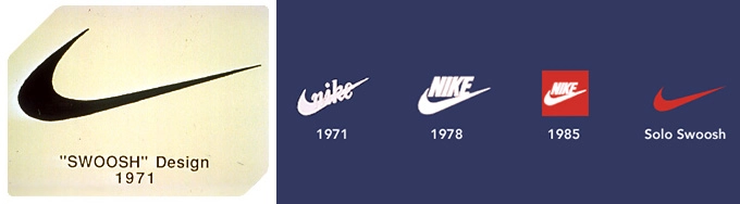
How the Swoosh Evolved and Endured
The original Swoosh from 1971 appeared thin and flexible, suited for the earliest Nike running shoes. By 1978, the company adopted a bolder wordmark that strengthened the overall identity. In 1985, a red square version appeared in packaging and advertising. As Nike entered the 1990s, the Swoosh began standing on its own without accompanying text. Its simplicity and geometric clarity allowed it to remain instantly recognizable across materials and scales, from shoes to billboards, while retaining its sense of motion and energy. The curve still communicates motion with a single stroke, and its presence continues to define the visual language of modern sport. The Swoosh shows how a straightforward idea, executed with clarity, can alter the course of design history.