 Home
Home Articles
 Twos Talks
 Videos
Top 10 Worst Football Logos of All Time
A design-focused ranking of football’s worst logos, examining the most controversial identity decisions behind them.

What makes a football logo truly bad? It’s not always about aesthetics. The worst football logos often fail to communicate identity, scale effectively across different applications, or create a memorable visual impression. For this ranking, we focused on design rather than sporting success, selecting ten logos that stand out for the wrong reasons and examining the identity, branding, and visual communication issues behind each case.
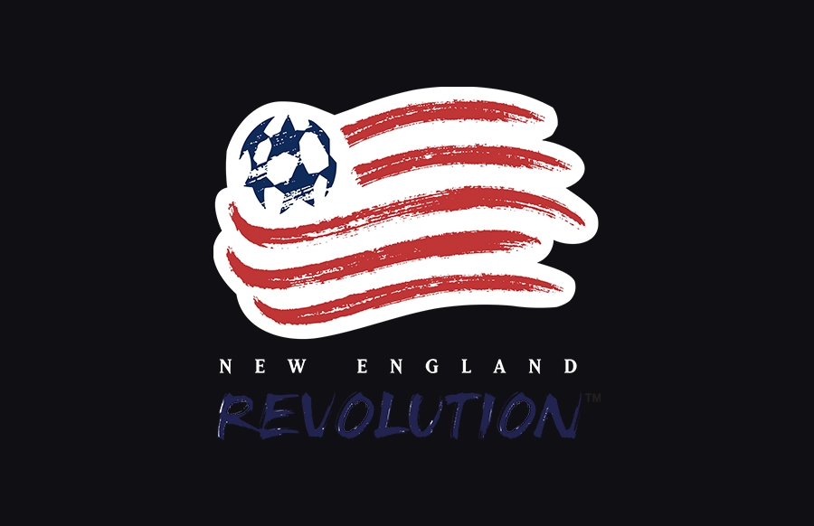
10. New England Revolution (1996–2021)
Before adopting its cleaner modern identity in 2021, the American club used a logo that felt firmly rooted in the design trends of the 1990s. The crest combined a stylized American flag, multiple stripes, stars, gradients, and layered graphic elements into a mark that often struggled at smaller sizes. The logo aimed to communicate both patriotism and motion, but the result felt visually crowded and increasingly outdated as sports branding moved toward simpler and more versatile identities. Its longevity made it familiar, but familiarity alone could not solve its underlying design issues.
Design Takeaway: A logo should remain recognizable even when its details disappear.
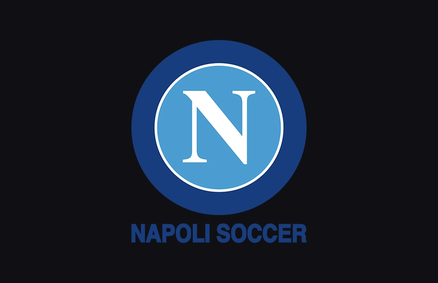
9. SSC Napoli (2004–2005)
Following the bankruptcy of SSC Napoli in 2004, the club was re-founded as Napoli Soccer and adopted a new identity during this transitional period. Compared to the traditional crest associated with Napoli’s history, the visual system used at the time moved toward a more simplified and utilitarian approach, relying heavily on basic wordmark applications rather than a strongly developed emblem. While functional for a short-term restructuring phase, it lacked the depth of character that supporters associated with the club’s established visual identity. Even after promotion back to Serie A, the system felt more like a temporary solution than a fully formed brand.
Design Takeaway: Reducing visual elements should strengthen identity, not erase it.
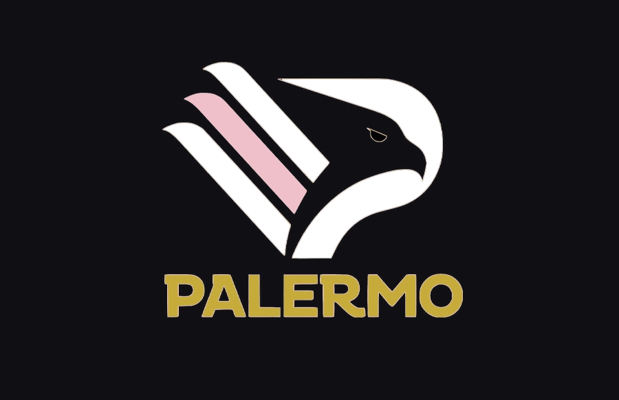
8. Palermo F.C. (2024–Present)
Palermo’s recent logo shows that a logo does not have to be poorly designed to be unsuccessful. Sometimes the failure lies in how little of an identity remains once the simplification is complete. When Palermo unveiled its new logo in 2024, reactions were immediate and divided. The redesign replaced the club’s traditional eagle with a highly simplified geometric mark that prioritized minimalism over symbolism. The identity was intended to feel modern and adaptable, but many critics argued that it reduced too much of the club’s visual heritage. While the logo functions effectively across digital platforms, its stripped-down approach leaves limited reference to the distinctive character that defined Palermo’s identity for decades.
Design Takeaway: Simplification should clarify an identity, not make it harder to recognize.
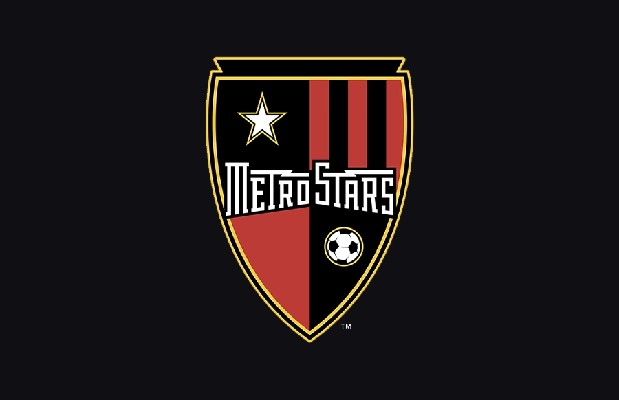
7. Metro Stars
Before the club became New York Red Bulls, it competed under the name MetroStars and introduced a redesigned logo in 2003 that reflected many of the branding trends popular in early MLS design. A shooting star, a football, bold typography, and layered effects were combined into a single mark intended to communicate energy and motion. However, these elements did not establish a clear connection to the club itself. Instead of forming a lasting identity, the logo felt like a collection of generic sports branding cues common to the period. The club’s later rebrand in 2006 further highlighted how little long-term identity the MetroStars visual system had established.
Design Takeaway: A logo should express a unique identity, not rely on generic visual shortcuts.
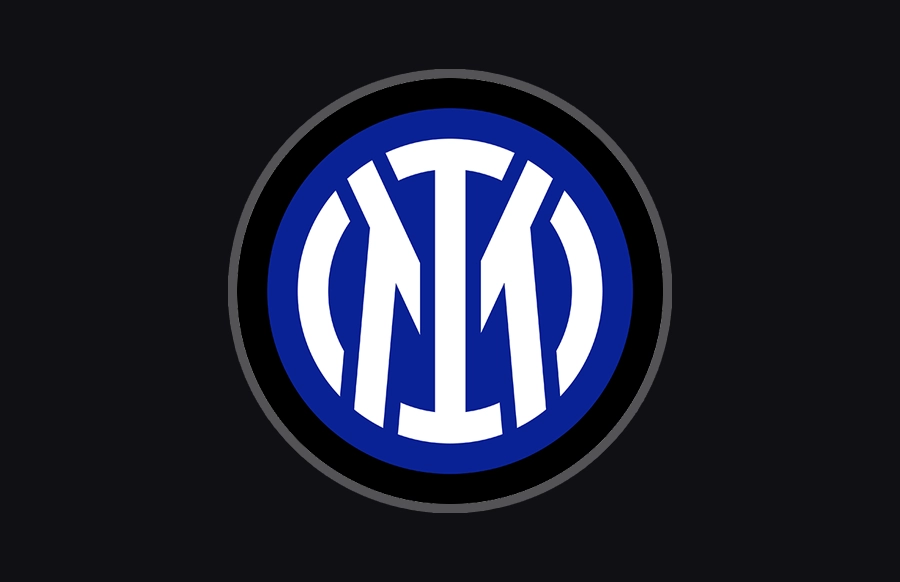
6. Inter Milan (2021–Present)
Inter Milan’s 2021 rebrand sparked debate among designers and football fans alike. The club replaced its traditional crest with a simplified monogram built around the letters “I” and “M,” removing many of the visual elements that had defined the badge for decades. The new logo was designed to work more effectively across digital platforms and modern branding applications, but critics argued that it moved too far toward a corporate identity. The redesign improved versatility, but it weakened some of the visual character that had made Inter’s crest instantly recognizable.
Design Takeaway: Modernization should strengthen recognition, not dilute it.
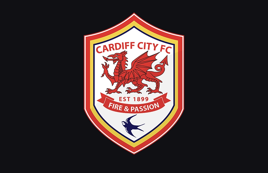
5. Cardiff City (2012–2015)
Cardiff City’s 2012 rebrand is one of the most controversial identity changes in modern football. The club introduced a new crest centered around a large red dragon, which reduced the visual prominence of the bluebird that had long been associated with Cardiff’s identity. The redesign attempted to establish a new direction for the club, but many supporters felt disconnected from the symbolism it introduced. While the logo functioned as a standalone design system, it did not align with the identity that fans had already embraced as their own.
Design Takeaway: A logo cannot succeed if the identity behind it is rejected.
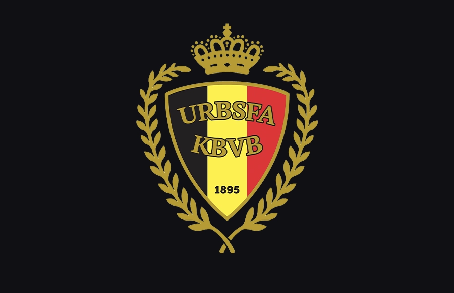
4. Belgium National Team (2011–2019)
Before its redesign in 2019, Belgium used a crest that combined multiple national symbols within a compact and highly detailed composition. The design included elements such as a crown, shield, decorative branches, typography, and other symbolic references tied to national identity. While each element carried meaning individually, together they created a badge with limited visual hierarchy and clarity. As football branding trends shifted toward simpler and more scalable systems, the complexity of the crest made it harder to maintain strong recognition across different contexts.
Design Takeaway: When everything is emphasized, nothing stands out.
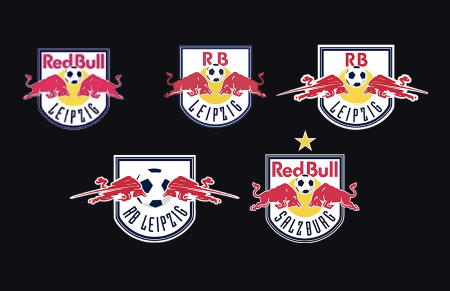
3. Red Bull Salzburg (2005–2022)
Red Bull Salzburg’s visual identity is often cited as an example of how corporate branding can shape a football club’s visual system over time. Since Red Bull’s takeover in 2005, the club’s identity has consistently incorporated the company’s branding language as a central element of its crest system. Across different iterations used over the years, the Red Bull mark remained a dominant visual component, creating a strong association with the parent brand. While the identity is clean, consistent, and commercially effective, it has often been discussed in design circles as prioritizing corporate structure over local football heritage.
Design Takeaway: A strong logo should represent the club first and the owner second.
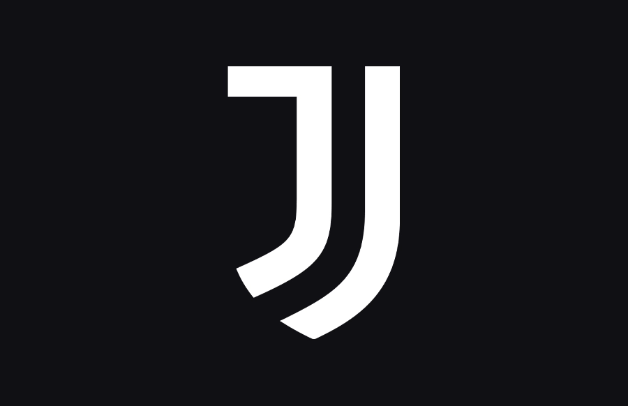
2. Juventus (2017–Present)
Juventus’ 2017 logo is one of the most influential and controversial redesigns in football history. The club abandoned the traditional elements linked with football crests and replaced them with a minimalist symbol centered around a stylized “J.” The redesign was intended to transform Juventus from a football club into a broader lifestyle and entertainment brand. Many designers praised its simplicity and versatility, but critics argued that the logo moved too far away from the visual language that supporters traditionally associate with football. The new logo became instantly recognizable, but the debate around it never really disappeared.
Design Takeaway: Simplicity becomes a problem when recognition comes at the expense of identity.
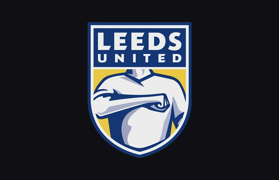
1. Leeds United (2018)
Few football logos have faced a backlash as immediate as Leeds United’s 2018 logo redesign. The redesign was created to celebrate the club’s supporters, but the new badge replaced traditional football symbolism with a stylized figure performing the “Leeds Salute.” The problem was not a lack of effort or technical execution. It was that the symbol failed to capture what supporters believed represented their club. Within days of its unveiling, the design was widely criticized by fans, designers, and media outlets, which forced Leeds United to abandon the project before it could become the club’s official long-term identity. The logo has since become one of football’s most cited examples of how quickly a rebrand can fail when it loses touch with its audience.
Design Takeaway: A logo succeeds when people see themselves in it.
Short Answers
What makes a football logo bad?
A football logo is considered bad when it fails to communicate a clear identity, becomes visually cluttered, or does not work well across different formats and sizes.
What is the worst football logo ever?
There is no single agreed answer, but logos like Leeds United (2018) and Juventus (2017) are often cited among the most controversial due to their identity-driven redesigns.
Why do football clubs change their logos?
Clubs usually change logos to modernize their identity, improve digital usability, or align with new commercial and branding strategies.


