Home
Home Articles
 Twos Talks
 Videos
Top 20 Best Video Game Logos, Ranked by Graphic Design
The video game logos that became as memorable as the worlds they represent. Explore the 20 best video game logos ranked by graphic design. Discover the typography, symbols, and visual identities that shaped gaming history.
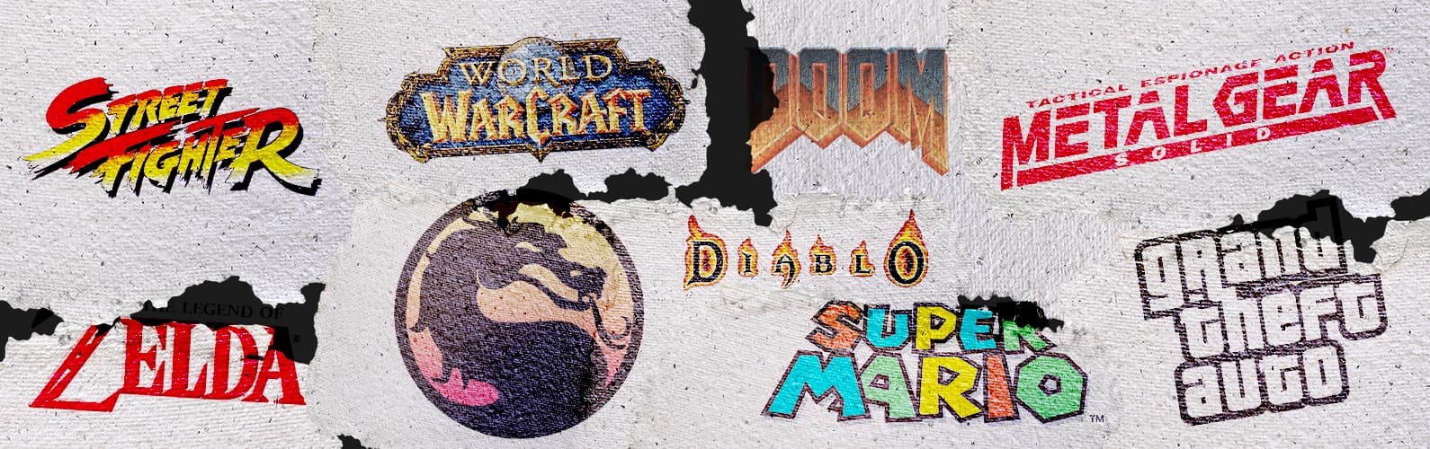
A great video game logo creates a visual language for an entire world. It shapes the way players remember a game long before they experience it.
Over the years, gaming logos have grown beyond simple wordmarks into carefully designed identities that combine typography, symbolism, atmosphere, and storytelling. Bold lettering, distinctive shapes, and unexpected visual decisions have helped some logos become inseparable from the experiences they represent. Some of these identities may reflect the visual trends of their era, but their importance lies in how effectively they defined their worlds and influenced the visual language of gaming.
This ranking examines 20 of the most influential video game logos from a graphic design perspective. We focus on visual impact, originality, versatility, and long-term influence, rather than the popularity or quality of the games themselves.
The year shown with each entry refers to the version of the logo discussed in this ranking, not necessarily the original release date of the game.

20. Portal
2007 | Valve
When Portal was released in 2007, its unusual concept and minimalist world made it stand apart from many of the mainstream games of its era. The visual identity followed the same philosophy. The logo treats simplicity as a design decision, creating recognition through clean typography, balanced spacing, and a restrained composition.
The wordmark avoids complex symbols and decorative elements, capturing the game’s precise and experimental nature. Like Portal’s puzzles, the design leaves room for interpretation and rewards attention through subtle choices rather than visual excess.
Design Takeaway
Good design creates curiosity before it provides answers.
19. The Elder Scrolls V: Skyrim
2011 | Bethesda
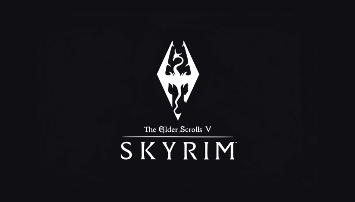
The Skyrim logo uses a restrained visual language centered on the dragon emblem and a sense of ancient authority.
To create the feeling of a forgotten empire or an artifact from another era, the design uses sharp geometry, metallic details, and classical typography. Instead of explaining the fantasy world behind it, the identity suggests history, power, and mythology through a single recognizable symbol.
Design Takeaway
A simple symbol can carry the weight of an entire universe.
18. Silent Hill
1999 | Konami
The Silent Hill logo looks as if it has already been through the world it represents. Its uneven letterforms and worn texture create a sense of decay, transforming a simple wordmark into part of the game’s unsettling atmosphere.
The design avoids many of the visual clichés associated with horror games. There are no obvious monsters, sharp symbols, or dramatic illustrations. Instead, the identity uses subtle imperfections that suggest something damaged and unfamiliar. The result feels like a fragment from the abandoned town itself.
Design Takeaway
Imperfection can become a powerful visual signature.
17. Street Fighter
1987 | Capcom
The Street Fighter logo captures the energy of competition through typography alone. It has bold, slanted letterforms and aggressive shapes that suggest movement, impact, and intensity.
Many fighting game identities depend heavily on characters or illustrations, but this logo builds recognition through its own visual language. The strong contrast, dynamic composition, and exaggerated forms reflect the fast-paced nature of the series.
Through a typography-based approach, the logo is instantly recognizable across generations.
Design Takeaway
Typography can become a visual expression of movement and energy.
16. Halo
2001 | Microsoft
At the beginning of the 2000s, science fiction games were exploring new ways to represent futuristic worlds. Halo took a more controlled approach and built its identity around atmosphere instead of visual complexity.
The metallic typography, carefully spaced letters, and subtle futuristic details create a sense of scale and technology without overwhelming the viewer. The result feels advanced but controlled, matching a universe built around exploration, conflict, and mystery. The Halo logo has maintained this visual approach for more than two decades, becoming an essential part of the franchise’s identity.
Design Takeaway
Strong identities often communicate more through atmosphere than explanation.
15. Resident Evil
1996 | Capcom
The Resident Evil logo creates tension through typography. The design doesn’t follow horror clichés. Sharp letterforms, high contrast, and dramatic styling create an immediate sense of danger.
The design balances readability with atmosphere, allowing the identity to stay memorable across different installments without losing its distinctive character.
The typography carries much of the emotional weight in this memorable design.
Design Takeaway
Typography can communicate emotion even without illustration.
14. Diablo
1996 | Blizzard Entertainment
The Diablo logo uses typography as a visual statement. It creates a sense of darkness and authority through sharp forms, strong contrast, and a memorable silhouette. But the logo doesn’t spoil the world behind it.
By employing contrast and aggressive details, the design reflects the game’s dark fantasy world. The logo communicates danger, mystery, and a sense of ancient evil through its own structure.
Design Takeaway
Typography can create a sense of power through form alone.
13. Assassin’s Creed
2007 | Ubisoft
The Assassin’s Creed logo was designed around a simple geometric symbol, creating one of the most recognizable identities in modern gaming. The design is closely connected with the series’ themes of secrecy, history, and hidden civilizations.
The strength of the design comes from its balance between mystery and simplicity. The sharp edges, symmetrical structure, and controlled proportions create a precise visual language for the fictional Assassin Order across different eras and settings.
Design Takeaway
A simple symbol can become powerful when it carries a larger story.
12. World of Warcraft
2001 | Blizzard Entertainment
The World of Warcraft logo establishes the scale and fantasy of the game through a highly detailed visual identity. The design uses metallic lettering, layered composition, and decorative elements. The whole composition evokes the feeling of an epic adventure before the world of Azeroth is explored.
The design embraces complexity as part of its character. The combination of ornate typography and strong framing gives the logo the presence of a fantasy emblem while keeping the title immediately recognizable.
Design Takeaway
Complexity can create recognition when every detail serves the identity.
11. Metal Gear Solid
1998 | Konami
In 1998, video games were entering a new era. The PlayStation was changing expectations around storytelling and cinematic presentation, and Metal Gear Solid arrived with the ambition of a spy thriller rather than a traditional action game.
The logo carried that cinematic ambition into its visual identity. The sharp, metallic typography feels closer to a film title sequence than a conventional game label. Unlike many action titles of its era, Metal Gear Solid did not rely on exaggerated effects to create impact. The design combines military discipline with futuristic technology to create an identity that suggests precision, secrecy, and control before the player even enters the game.
Design Takeaway
A strong identity can bridge different visual languages.
10. DOOM
1993 | id Software
The DOOM logo looked futuristic even before players entered the game. At a time when game graphics were still limited, the visual identity suggested something larger than the technology behind it.
The bold metallic lettering, sharp angles, and dramatic composition gave DOOM the appearance of a science fiction title rather than a simple game label. The design captured the atmosphere of futuristic weapons, alien worlds, and intense action without adding unnecessary visual elements.
Design Takeaway
A logo can create a world before the audience enters it.
9. Grand Theft Auto
2001 | Rockstar Games
The Grand Theft Auto logo introduced with GTA III in 2001 is instantly recognizable among gamers. It established the visual identity that the series still uses today. GTA constantly reinvents its cities, stories, and characters, but its visual identity has stayed remarkably consistent for nearly three decades.
The stacked typography, bold outlines, and high-contrast composition give the logo an unmistakable presence across every release. The design doesn’t necessarily mirror the chaos of the games and relies on consistency and strong visual hierarchy to create instant recognition.
That consistency turns every new installment into another chapter of the same visual identity.
Design Takeaway
Consistency can become a brand's strongest asset.
8. Pac-Man
1980 | Namco
Before video game characters became fully developed mascots, Pac-Man introduced a visual identity created around immediate recognition. The design captures the same simplicity that made the game accessible. Clear lettering, bright colors, and a playful personality reflect that simplicity.
The importance of the design comes from how closely the logo, character, and game experience were connected. The identity establishes the idea that a video game could have a memorable visual personality beyond the screen.
More than four decades later, the Pac-Man logo remains a reference point for the idea that simplicity and character can shape gaming culture.
Design Takeaway
Simplicity can become iconic when it is connected to a clear idea.
7. The Legend of Zelda
1991 | Nintendo
By the early 1990s, The Legend of Zelda had developed a visual identity that reflected its growing fantasy universe. The game needed an identity that could communicate adventure, mystery, and a sense of discovery before players entered its world.
The Zelda logo achieves that through a balance between fantasy and familiarity. The decorative typography, bold outlines, and fantasy-inspired styling create an identity that immediately suggests adventure and discovery.
More than a title, the logo has become a symbol of one of gaming’s most enduring fantasy worlds.
Design Takeaway
A lasting identity evolves without losing its original character.
6. Tetris
1998 | Tetris
The Tetris logo turns a simple wordmark into a visual expression of structure and balance. The geometric forms, colorful blocks, and clear arrangement connect the identity with the fundamental rhythm of the game itself.
The design succeeds because it communicates an idea with minimal elements. The logo feels organized, playful, and instantly recognizable, reflecting a game built around order, repetition, and problem-solving.
Design Takeaway
A logo can become memorable when its visual structure follows the logic of the experience.
5. Minecraft
2011 | Mojang
The Minecraft logo became a direct extension of the world it represents. Its blocky letterforms immediately communicate the core idea of the game. This decision turns the name itself into part of the visual experience.
The three-dimensional typography, rough texture, and block-inspired details show the creative and modular nature of Minecraft’s universe. The design transforms a simple wordmark into an identity that feels connected to the game’s mechanics.
As Minecraft grew from an independent project into one of the most influential games in history, its logo remained a consistent visual symbol of creativity, exploration, and endless possibilities.
Design Takeaway
The strongest identities emerge from the core idea of the product.
4. Mortal Kombat
1992 | Midway
The Mortal Kombat logo built its identity around one of the most recognizable symbols in fighting games: the dragon emblem. The circular form, sharp details, and balanced composition create a visual mark that feels powerful without requiring additional elements.
Unlike many fighting game identities that rely heavily on characters, the Mortal Kombat logo carries the personality of the series through a single symbol. Its combination of mystery, strength, and simplicity has allowed the identity to remain recognizable across decades of visual changes.
Design Takeaway
A powerful symbol can become the strongest element of a brand identity.
3. Final Fantasy
1987 | Square
The Final Fantasy logo introduced a different approach to fantasy branding. At a time when fantasy games often relied on familiar symbols and medieval imagery, the series built its identity around simplicity, elegance, and imagination.
The combination of refined typography and Yoshitaka Amano’s artwork created a visual system that could change with every installment while maintaining a recognizable character. Instead of representing one specific world, the logo became a flexible framework for dozens of different stories, characters, and visual directions.
This balance between consistency and reinvention helped Final Fantasy develop one of the most distinctive identities in gaming history.
Design Takeaway
A strong identity can remain recognizable while leaving space for evolution.
2. Pokémon
1998 | Nintendo
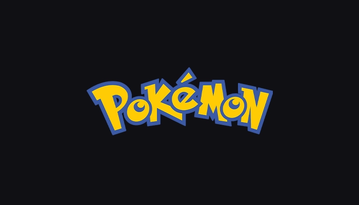
By the time Pokémon reached international audiences in 1998, the series needed a visual identity that could appeal to children and still be distinctive enough to grow into a global phenomenon.
The logo solves that challenge by creating a distinct personality. The rounded letterforms, playful curves, and bold colors give the logo an energetic and friendly character. At the same time, the design has enough consistency and recognition to work across games, cards, animation, and merchandise.
Few gaming identities have maintained such a strong connection with multiple generations. The Pokémon logo feels familiar without becoming outdated, making it a strong example of how playful design can achieve lasting impact.
Design Takeaway
Playful design can become timeless when it is built with consistency.
1. Super Mario
1996 | Nintendo
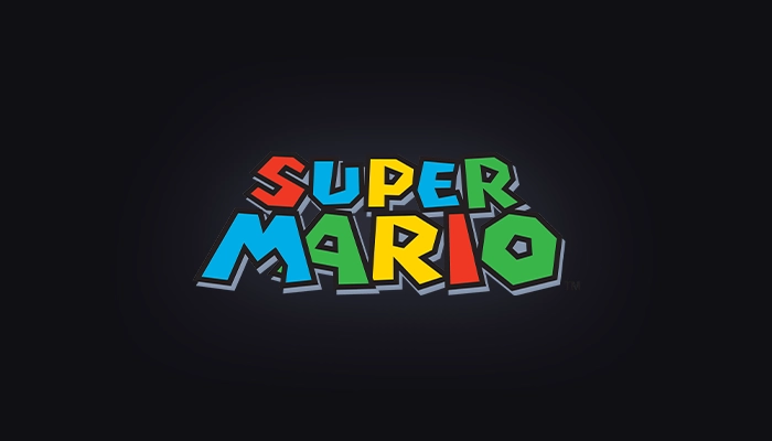
Few video game logos have achieved the level of recognition and flexibility of the Super Mario identity. The design succeeds not through complexity, but through a precise balance between personality, readability, and adaptability.
The bold typography, rounded forms, and playful color choices capture the optimistic spirit of the franchise while remaining instantly recognizable across different generations and platforms. From classic 2D adventures to modern 3D worlds, the logo has adapted without losing its original character.
Its greatest achievement is turning a simple wordmark into a global symbol of gaming culture.
Design Takeaway
The strongest identities balance personality with universal recognition.