 Home
Home Articles
 Twos Talks
 Videos
Top 5 Most Iconic Video Game Logos of All Time
Across four decades of gaming, these five iconic video game logos show how smart visual design can turn a title into a lasting cultural landmark.

Video games have grown from arcade curiosities into one of the most influential cultural forces of the last forty years, and their logos grew in importance alongside them. A strong logo gives a game its visual presence, signals its world and attitude, and stays with players long after the screen goes dark. Over time, some logos have become touchstones for entire communities and eras of gaming. This article highlights five examples that show how design, culture, and technology came together to create the most enduring symbols in the medium.
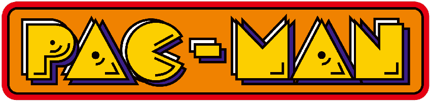
1. PAC-MAN (1980)
Pac-Man’s logo became one of the most immediately recognizable marks in early video games. When Namco released the game in Japan under the title Puck-Man, designer Toru Iwatani based the mascot and logo on a pizza missing a slice. The shape prioritized simplicity, readability, and a direct connection to the character’s basic action: eating.
For the international release, the name changed to Pac-Man to prevent arcade vandalism. The logo experienced several stylistic updates, but its basic form remained unchanged. Its shape conveys the character and the game’s central action, associating the symbol directly with gameplay. Over time, it became a reference point for how early video games represented characters and mechanics visually.
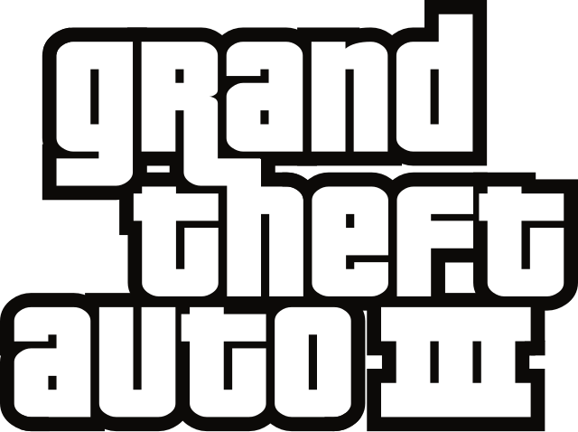
2. GRAND THEFT AUTO (2001)
The GTA logo changed alongside the franchise it represents. The original 1997 version used bold, simple letters with an urban aesthetic that suggested the game’s chaotic, open-world environment. By GTA III (2001), the logo adopted a more structured design, placing the “GTA” letters against a city backdrop.
Later versions adjusted proportions and alignment to suit contemporary graphic standards. The design communicates the series’ tone and setting without relying on additional imagery. Changes in typography and framing correspond to the increasing scale and complexity of the games rather than attempts to make the logo more decorative.
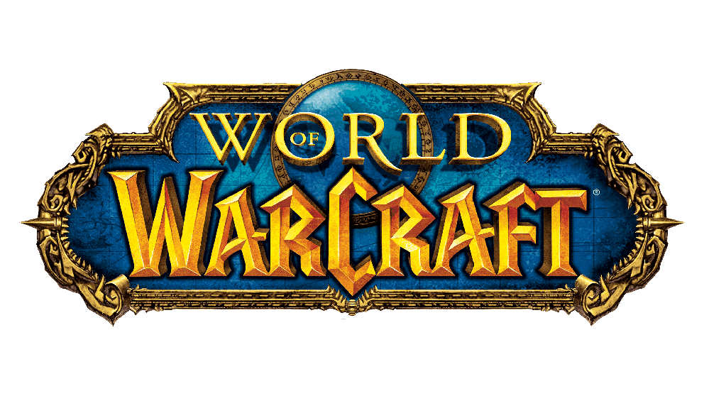
3. WORLD OF WARCRAFT (2004)
The World of Warcraft logo first appeared in 2004, and its golden serif type and oval frame draw from medieval lettering and emblematic forms common in fantasy fiction. The structure signals the scale and tone of the game’s world and situates players in a universe built around history, factions, and lore.
Across the expansions, small adjustments appeared, but the core structure stayed the same because it provides a stable frame for a shifting world. The oval forms a contained space where opposing ideas coexist, alluding to the ongoing tension between Alliance and Horde. The design offers a consistent reference point within a universe that continues to expand.
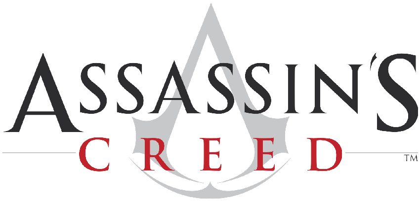
4. ASSASSIN’S CREED (2007)
The Assassin’s Creed logo combines a letterform with symbolic elements. The shape forms a stylized “A” while also suggesting an eagle’s skull and the Assassins’ hidden blade. These elements connect the logo directly to gameplay and the franchise’s themes.
Since its introduction in 2007, the logo has remained largely unchanged across different historical settings and storylines. Its consistency gives the franchise a fixed visual reference. The design communicates the identity and approach of the series clearly, without additional explanation.
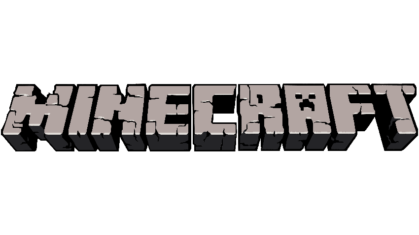
5. MINECRAFT (2011)
The earliest versions of Minecraft used a straightforward blocky wordmark that reflected the game’s pixel structure. The form did not attempt to tell a story; it followed the logic of a world built from squares. As the game gained popularity, Mojang made adjustments to the logo, adjusting the block-based style to clarify shapes and increase visual weight.
The 2011 redesign created the version most players now recognize. The letters became three-dimensional, echoing the cubic forms in the game itself. Later updates retained this approach, as the block structure continues to define Minecraft’s visual identity.


