Home
Home Articles
 Twos Talks
 Videos
What Is Anti-Design and Why It’s Coming Back in the Age of AI
In a world of polished AI-generated visuals, designers are rediscovering the power of imperfection. A short guide to Anti-Design, a design approach that challenges visual conventions and is re-emerging as a response to AI-generated perfection.
For decades, good design followed a clear formula: clean grids, balanced composition, and visual harmony. Design was supposed to be invisible, structured, and predictable.
In recent years, that stability has started to shift. Designers are once again questioning those rules. Layouts feel less controlled. Typography becomes more expressive. Imperfection is no longer a mistake, but a choice.
This shift is often referred to as Anti-Design.
In the age of AI, where polished visual systems can be generated almost instantly, this return to imperfection feels less like a trend and more like a response.
What is Anti-Design?
Anti-Design is a design approach that intentionally challenges or breaks established visual rules. It operates within design systems rather than outside them, using conventions such as grid structures, typographic hierarchy, and visual balance as points of tension rather than fixed constraints.
Rather than prioritizing consistency or clarity above all else, it allows expression, disruption, and visual friction to become active design choices.
This approach is not purely theoretical and has appeared in different forms throughout design history, particularly in experimental typography and editorial design.
At its core:
Anti-Design is not the absence of rules, but the conscious decision to break them.
How It Differs from Traditional Design
Traditional design prioritizes order, consistency, and readability. Anti-Design shifts that emphasis by introducing friction, unpredictability, and controlled disruption into the visual system.
Traditional design usually depends on structured grids, while Anti-Design may work with more flexible or broken compositions. Visual harmony in conventional systems gives way to visual tension, and what is usually predictable becomes open to surprise and disruption.
Consistency, in this context, is no longer a fixed goal but something that can be bent or deliberately interrupted. Even neutrality in tone is replaced by stronger, more expressive visual personalities.
This contrast is often what makes Anti-Design immediately recognizable, even when the result appears chaotic.
Where Did Anti-Design Come From?
Anti-Design is best understood not as a formal design movement, but as a recurring reaction that surfaces at different moments in design history. It is less a textbook category and more an evolving approach or sensibility within visual culture.
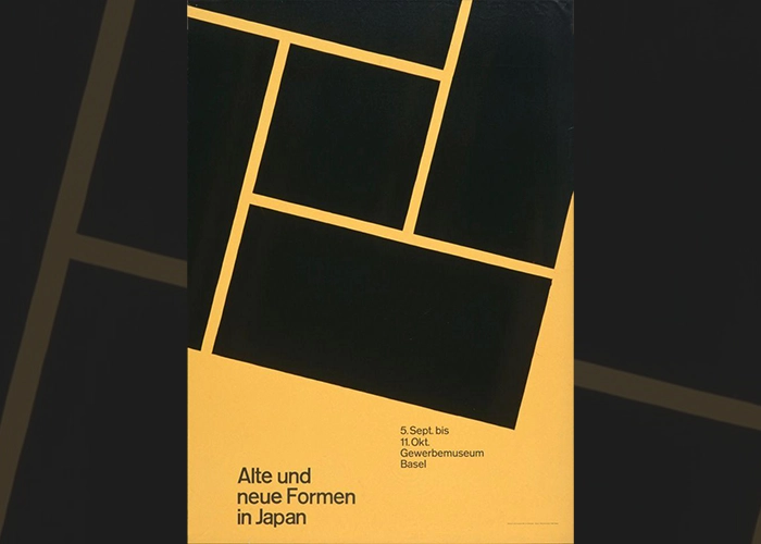
Its roots can be traced through the rejection of strict modernist systems, where clarity and rational structure defined much of visual communication. This tension became visible in the legacy of Swiss Style, whose rigid grid logic established order as a dominant principle in graphic design. Designers such as Wolfgang Weingart began questioning those conventions in the 1970s. His work showed that the grid could be stretched, reinterpreted, and treated as a creative tool rather than a fixed set of rules.
Later, experimental typography in the late 20th century pushed even further, introducing more expressive and unpredictable approaches to layout. This shift became especially visible in editorial and poster design within music and cultural contexts.
The conversation continued in the 1990s through the work of designers such as David Carson, who challenged readability and traditional hierarchy so radically that his work was celebrated by some as groundbreaking and criticized by others as intentionally difficult to read. That debate became one of the defining conversations in graphic design during the 1990s.
Where Did Anti-Design Come From?
Anti-Design is best understood not as a formal design movement, but as a recurring reaction that surfaces at different moments in design history. It is less a textbook category and more an evolving approach or sensibility within visual culture.
Its roots can be traced through the rejection of strict modernist systems, where clarity and rational structure defined much of visual communication. This tension became visible in the legacy of Swiss Style, whose rigid grid logic established order as a dominant principle in graphic design. Designers such as Wolfgang Weingart began questioning those conventions in the 1970s. His work showed that the grid could be stretched, reinterpreted, and treated as a creative tool rather than a fixed set of rules.
Later, experimental typography in the late 20th century pushed even further, introducing more expressive and unpredictable approaches to layout. This shift became especially visible in editorial and poster design within music and cultural contexts.
The conversation continued in the 1990s through the work of designers such as David Carson, who challenged readability and traditional hierarchy so radically that his work was celebrated by some as groundbreaking and criticized by others as intentionally difficult to read. That debate became one of the defining conversations in graphic design during the 1990s.
Why AI Is Bringing Anti-Design Back
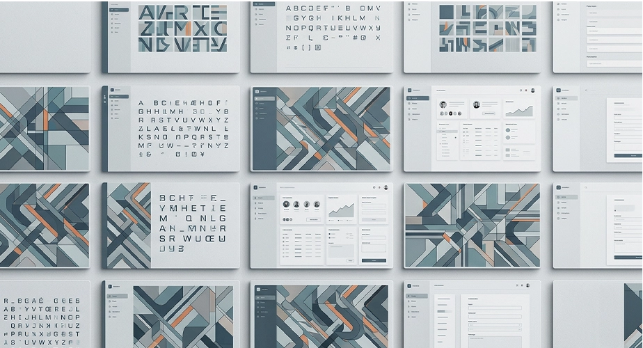
The AI era has made Anti-Design feel newly relevant. Today, AI-powered tools can generate clean layouts, balanced compositions, and polished visual systems in seconds. As this level of technical perfection becomes easier to achieve, it also loses its impact. What once demonstrated skill is quickly becoming the baseline.
At the same time, visual output is growing increasingly similar. AI-generated brand identities, social media graphics, and concept visuals frequently share the same polished aesthetic, even when they are created for entirely different purposes.
This is where Anti-Design finds new relevance. In an environment where almost everyone can create something polished, originality begins to depend less on perfection and more on perspective.
When Anti-Design Works
Not all visual disruption can be called Anti-Design. Challenging visual rules requires understanding them first. Without that awareness, disruption loses its meaning and quickly slips into poor execution.
Anti-Design is particularly effective in editorial design, cultural branding, music, fashion, and experimental campaigns, where expression and memorability can carry as much weight as clarity itself.
In healthcare, finance, government services, and utility-driven interfaces, however, consistency and readability usually take priority because users rely on clarity more than visual experimentation.
This renewed attention to Anti-Design reflects a broader shift in how originality is judged. As polished visuals become easier for anyone to produce, creative value increasingly comes from intention, interpretation, and a distinctive point of view.
The renewed interest in Anti-Design is therefore less about reviving an old aesthetic than recognizing a familiar idea in a new technological landscape. In many ways, AI has made the purpose of Anti-Design easier to understand.
Short Answers (FAQ)
What is Anti-Design in simple terms?
Anti-Design is a design approach that deliberately breaks or challenges established visual rules to create tension, expression, and unpredictability.
Is Anti-Design the same as bad design?
No. Bad design ignores structure. Anti-Design understands structure and intentionally challenges it with clear purpose.
Why is Anti-Design coming back?
As AI makes polished design faster and more accessible, many designers are turning to Anti-Design to create work that feels more distinctive, expressive, and intentionally human.