Home
Home Articles
 Twos Talks
 Videos
Why did Rockstar change the GTA 6 logo?
The change is subtle. The design problem behind it is much bigger.

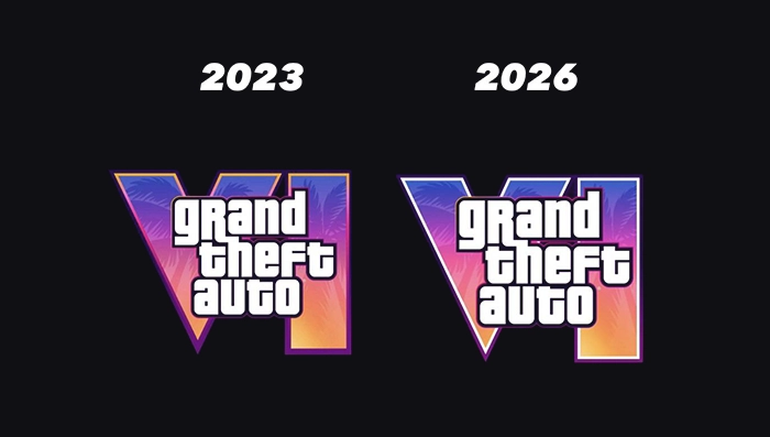
On June 18, Rockstar revealed the official cover art for Grand Theft Auto VI. Look closely at the logo and something has changed. The gradient outline that surrounded the Roman numeral in the original 2023 version is gone. In its place is a clean white inner border, with another outline added around the mark. It is a tiny adjustment. It changes how the logo works.
The first logo came with the reveal. The new one sits inside a much bigger visual system. The updated version has to work inside a much denser visual campaign, made up of cover art, character portraits, postcards and wallpapers. Rockstar has never publicly explained why it changed the logo. So, what does the design itself tell us?
The Original GTA 6 Logo
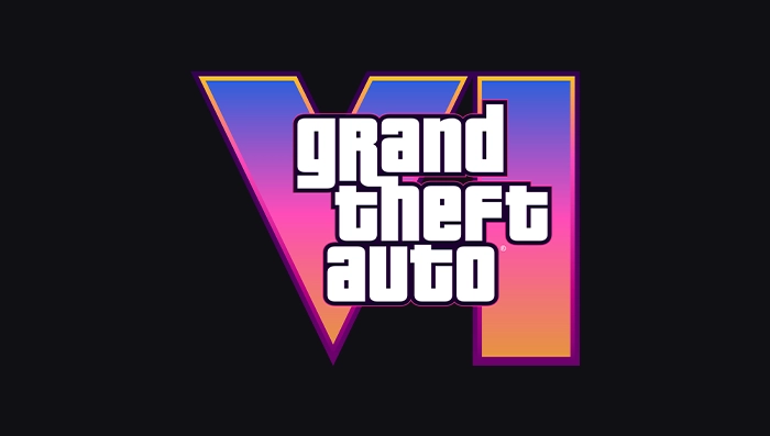
The original GTA VI logo appeared with the game’s first trailer on December 5, 2023. It kept the familiar Grand Theft Auto wordmark. The Roman numeral VI became the visual centerpiece, filled with a pink, purple and orange gradient and palm-tree silhouettes.
Then Something Changed
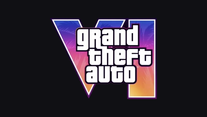
On June 18, 2026, Rockstar revealed the official cover art for Grand Theft Auto VI and announced that pre-orders would begin on June 25. The same release introduced the updated GTA VI logo.
The change is easy to miss. The familiar Grand Theft Auto wordmark and the VI remain in place. The inner border around the numeral is now white instead of a gradient. A second outline has also been added around it.
A Bigger Visual World
The GTA VI logo no longer appears on its own. Rockstar’s official artwork now includes character portraits, location postcards and the official cover art. Several pieces are available both with and without the logo. The mark has to work across a range of images and compositions.
The visual field is busier than it was in 2023. The official cover combines characters, vehicles and smaller scenes in a single composition. The VI still needs to stand out without overwhelming the image.
The logo is also being used as part of a broader campaign rather than a single reveal image. Some artwork carries the mark. Other versions leave it out entirely. That gives the identity more places to go and more situations to handle.
Why White?
The new border is most useful where the artwork is busiest. On the official cover, the VI sits over a dense collage of characters, vehicles and smaller scenes. The solid white edge separates the numeral from that detail without introducing another color into the composition.
Rockstar has not explained the reason for the update. We can only judge the result. The white border makes the VI easier to separate from its surroundings. For a logo moving through a much larger visual system, that may be all the change it needed.
FAQ
Why did Rockstar change the GTA 6 logo?
Rockstar has not publicly explained the reason. The updated border creates clearer separation between the logo and the artwork around it.
What changed in the GTA 6 logo?
The gradient border around the VI was replaced with a white inner border, with an additional outer outline added.
When did Rockstar change the GTA 6 logo?
The updated logo appeared on June 18, 2026, alongside the official GTA VI cover art.